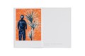
AHMED ALSOUDANI
+
category: catalogue / 2017
client: Marlborough Contemporary
details: 290 × 360 mm, 60 pp.
awards: TDC New York 2018

AHMED ALSOUDANI
category: catalogue / 2017
client: Marlborough Contemporary
details: 290 × 360 mm, 60 pp.
awards: TDC New York 2018
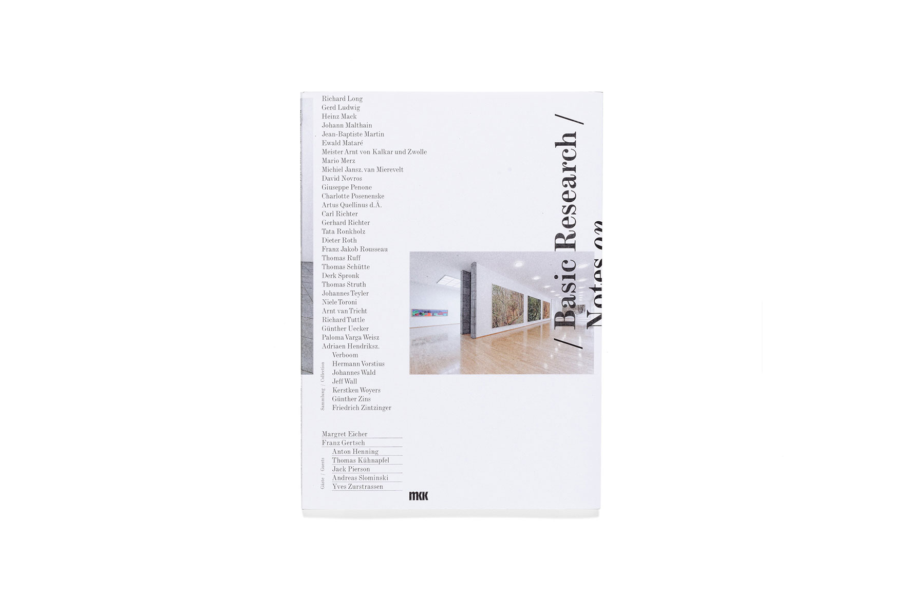
BASIC RESEARCH – NOTES ON THE COLLECTION
category: catalogue / 2014
client: Museum Kurhaus Kleve – Ewald Mataré-Sammlung
details: 218 × 305 mm, 64 pp.
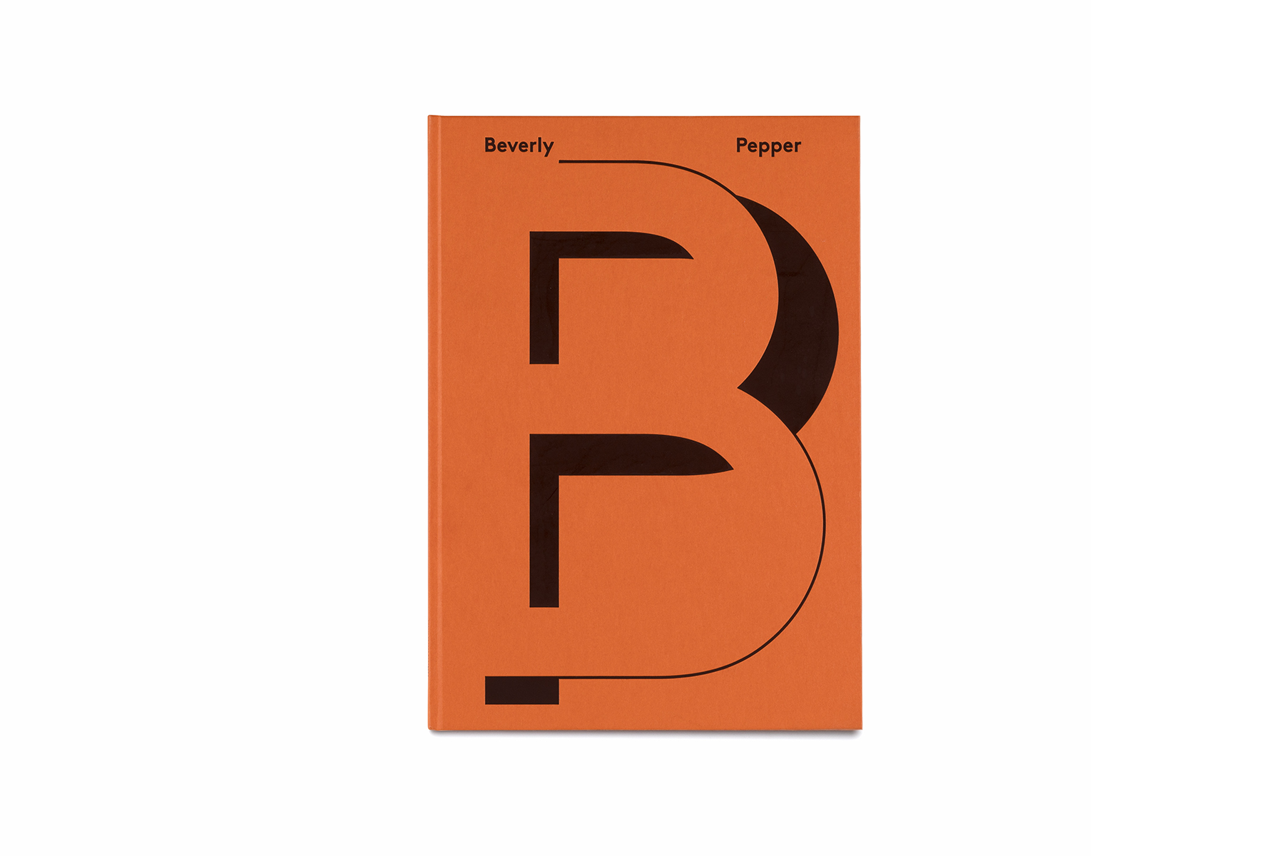
BEVERLY PEPPER
category: catalogue / 2019
client: Marlborough Gallery
details: 240 × 340 mm, 76 pp.
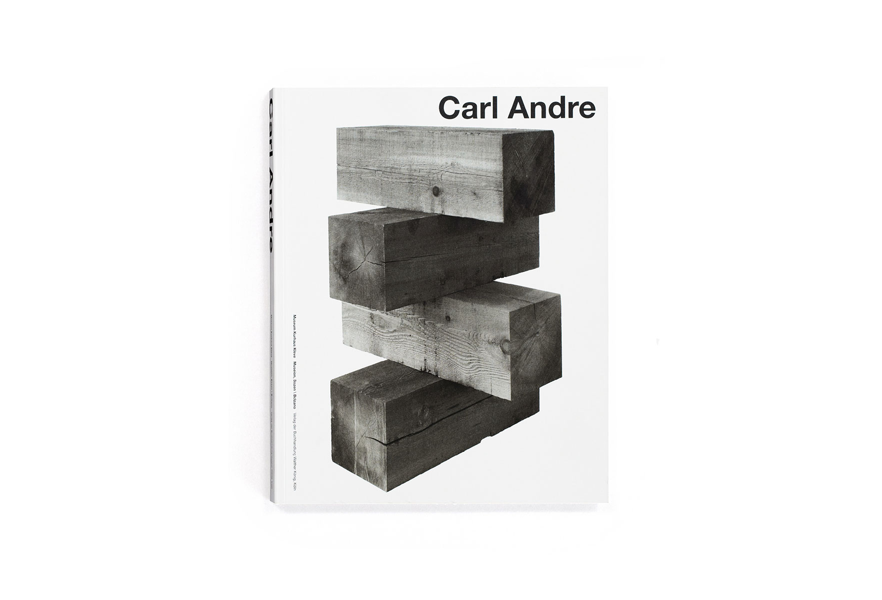
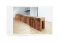
CARL ANDRE
category: catalogue / 2011
client: Museum Kurhaus Kleve – Ewald Mataré-Sammlung
details: 216 × 270 mm, 152 pp.
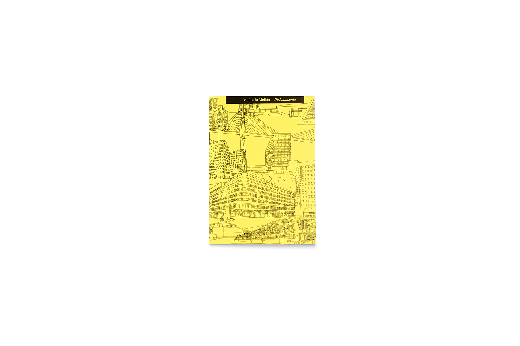
DISHAMMONIA
category: book / 2019
client: Michaela Melián / Spector Books
details: 120 × 170 mm, 76 pp.
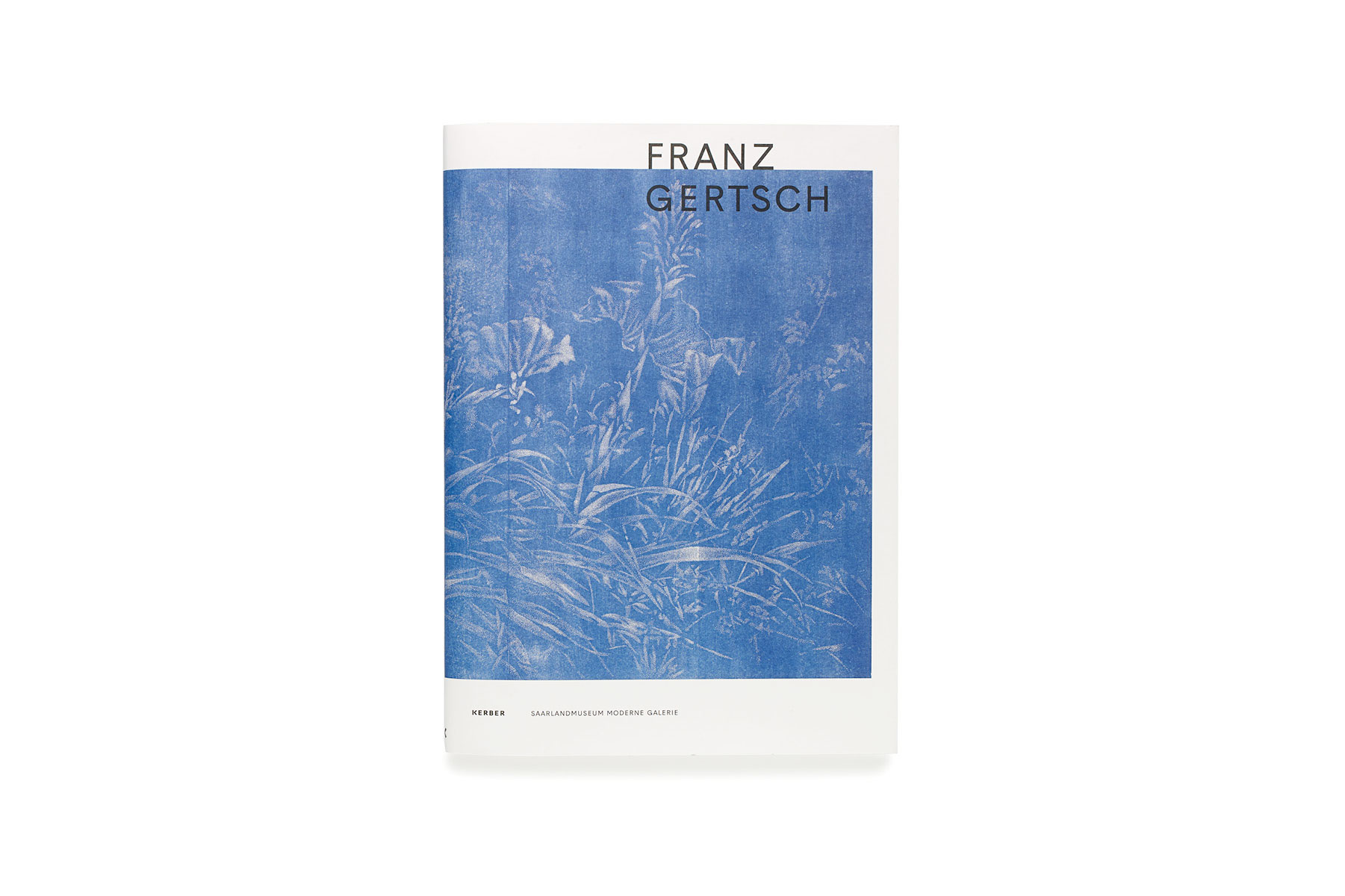
FRANZ GERTSCH
category: catalogue / 2015
client: Saarlandmuseum
details: 230 × 320 mm, 68 pp.

FRIEDRICH VON BORRIES. POLITICS OF DESIGN, DESIGN OF POLITICS
category: magazine / 2018
client: Die Neue Sammlung – The Design Museum
details: 232 × 328 mm, 160 pp.
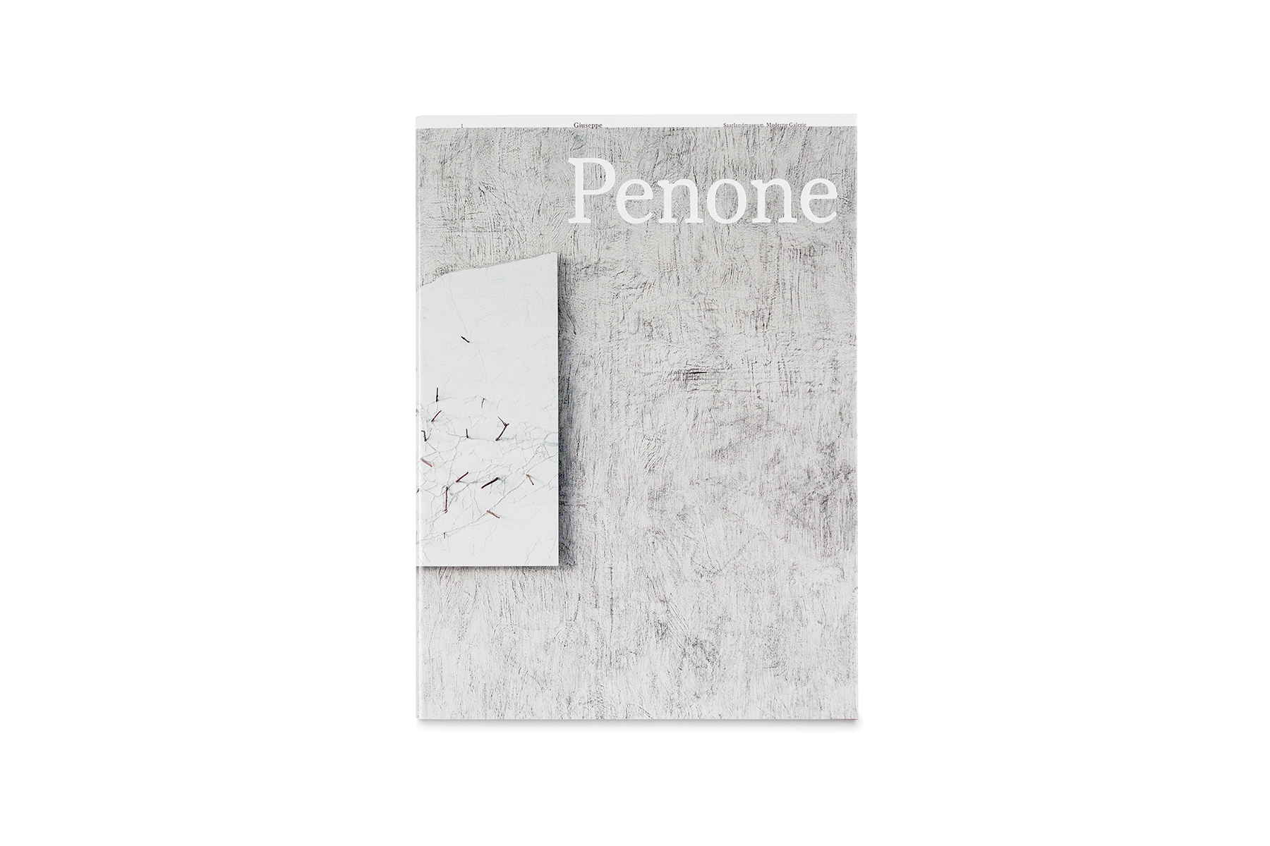
GIUSEPPE PENONE
category: catalogue / 2019
client: Saarlandmuseum
details: 230 × 320 mm, 84 pp.
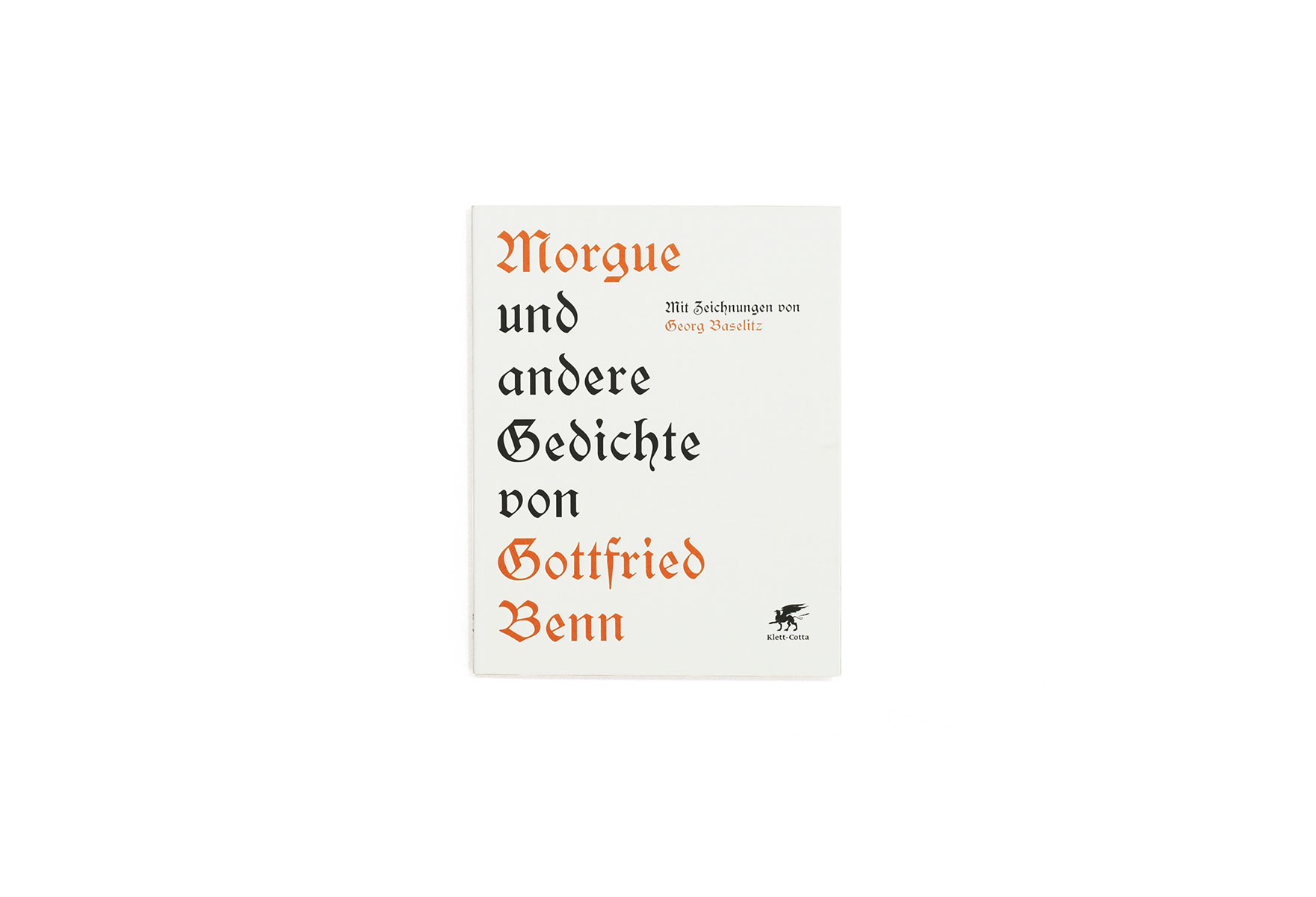
GOTTFRIED BENN. MORGUE UND ANDERE GEDICHTE
category: book / 2012
client: Klett-Cotta
details: 162 × 182 mm, 32 pp.
in collaboration with: Michael Zöllner
awards: Schönste Deutsche Bücher 2012

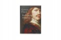
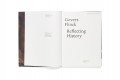
GOVERT FLINCK. REFLECTING HISTORY
category: catalogue / 2015
client: Museum Kurhaus Kleve – Ewald Mataré-Sammlung
details: 240 × 330 mm, 236 pp.
in collaboration with: Cyrill Kuhlmann
GREGOR HILDEBRANDT
category: catalogue / 2015
client: Saarlandmuseum
details: 230 x 320 mm, 160 pp.

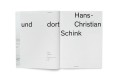
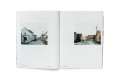
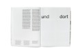
HANS-CHRISTIAN SCHINK. HIER UND DORT
category: catalogue / 2018
client: Saarlandmuseum
details: 210 × 280 mm, 92 pp.
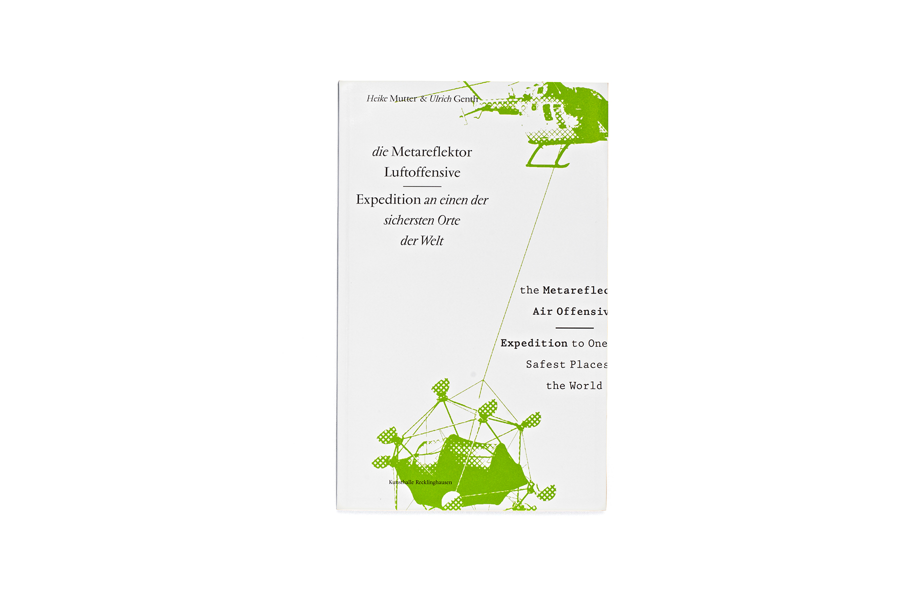
HEIKE MUTTER & ULRICH GENTH. METAREFLEKTOR LUFTOFFENSIVE
category: catalogue / 2006
client: Heike Mutter und Ulrich Genth
details: 210 × 330 mm, 56 pp.
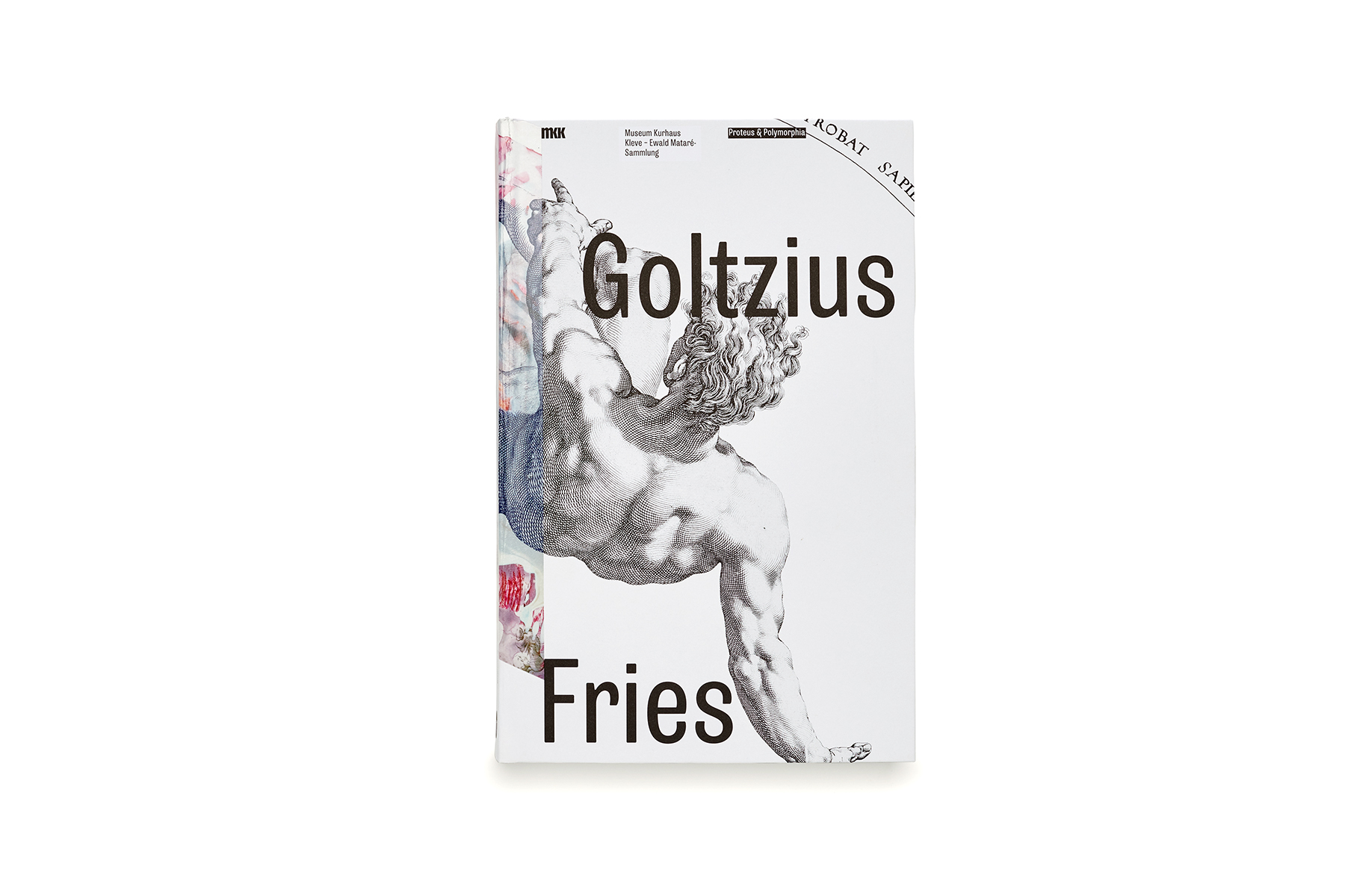
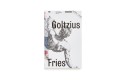
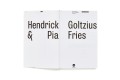
HENDRICK GOLTZIUS & PIA FRIES. PROTEUS & POLYMORPHIA
category: catalogue / 2017
client: Museum Kurhaus Kleve – Ewald Mataré-Sammlung
details: 198 × 305 mm, 260 pp.
awards: TDC Tokyo 2019 Excellent Work
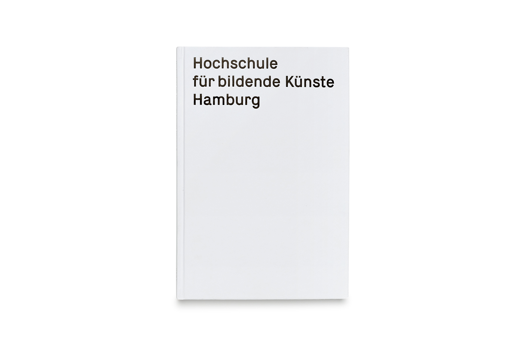
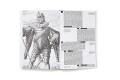
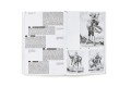
HOCHSCHULE FÜR BILDENDE KÜNSTE HAMBURG
category: book / 2017
client: Hochschule für bildende Künste Hamburg
details: 195 × 288 mm, 164 pp.
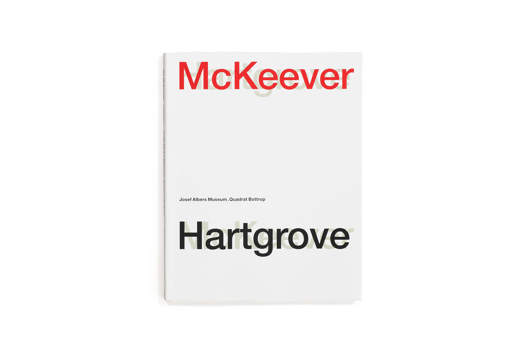
IAN MCKEEVER. HARTGROVE
category: catalogue / 2012
client: Josef Albers Museum Quadrat Bottrop
details: 230 × 290 mm, 156 pp.
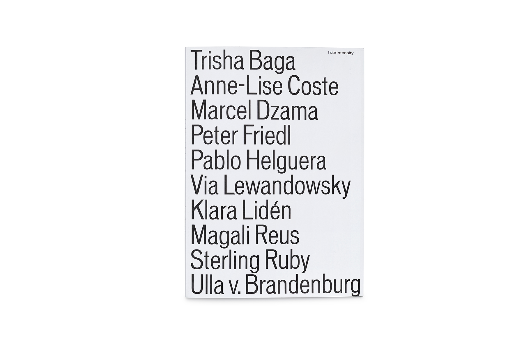
INSIDE INTENSITY
category: catalogue / 2017
client: Museum Kurhaus Kleve – Ewald Mataré-Sammlung
details: 218 × 305 mm, 68 pp.
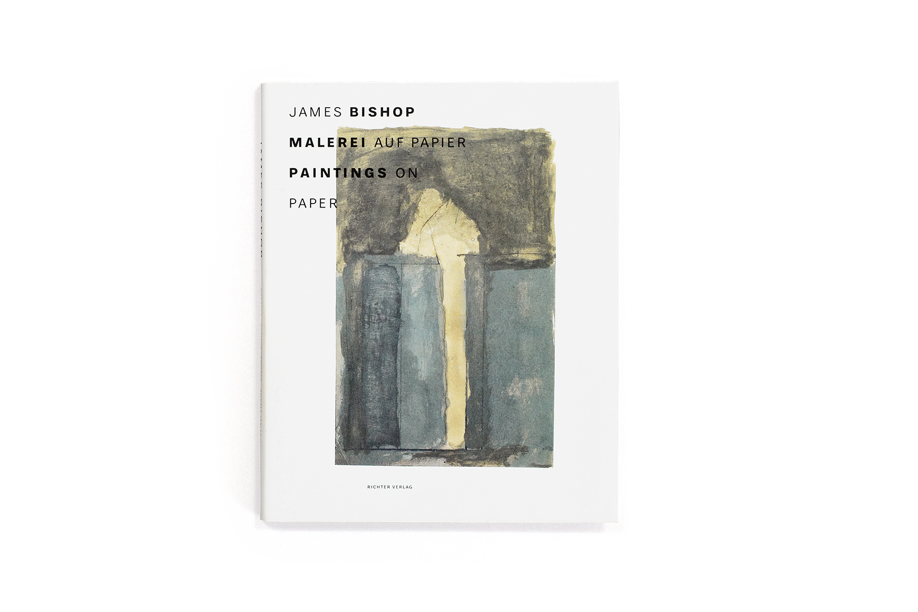
JAMES BISHOP. MALEREI AUF PAPIER / PAINTINGS ON PAPER
category: catalogue / 2017
client: Josef Albers Museum Quadrat Bottrop
details: 220 × 275 mm, 124 pp.
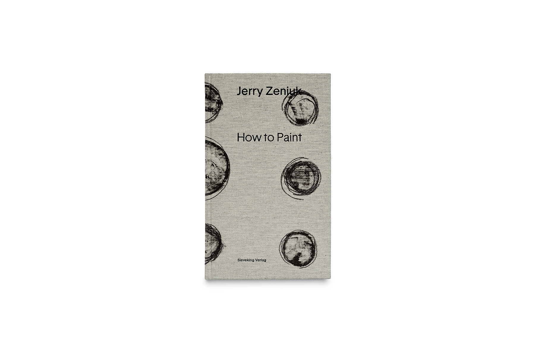
JERRY ZENIUK. HOW TO PAINT
category: book / 2017
client: Josef Albers Museum Quadrat Bottrop
details: 144 × 236 mm, 144 pp.

JOSEF ALBERS MUSEUM QUADRAT BOTTROP
category: visual identity / 2008 –
client: Josef Albers Museum Quadrat Bottrop
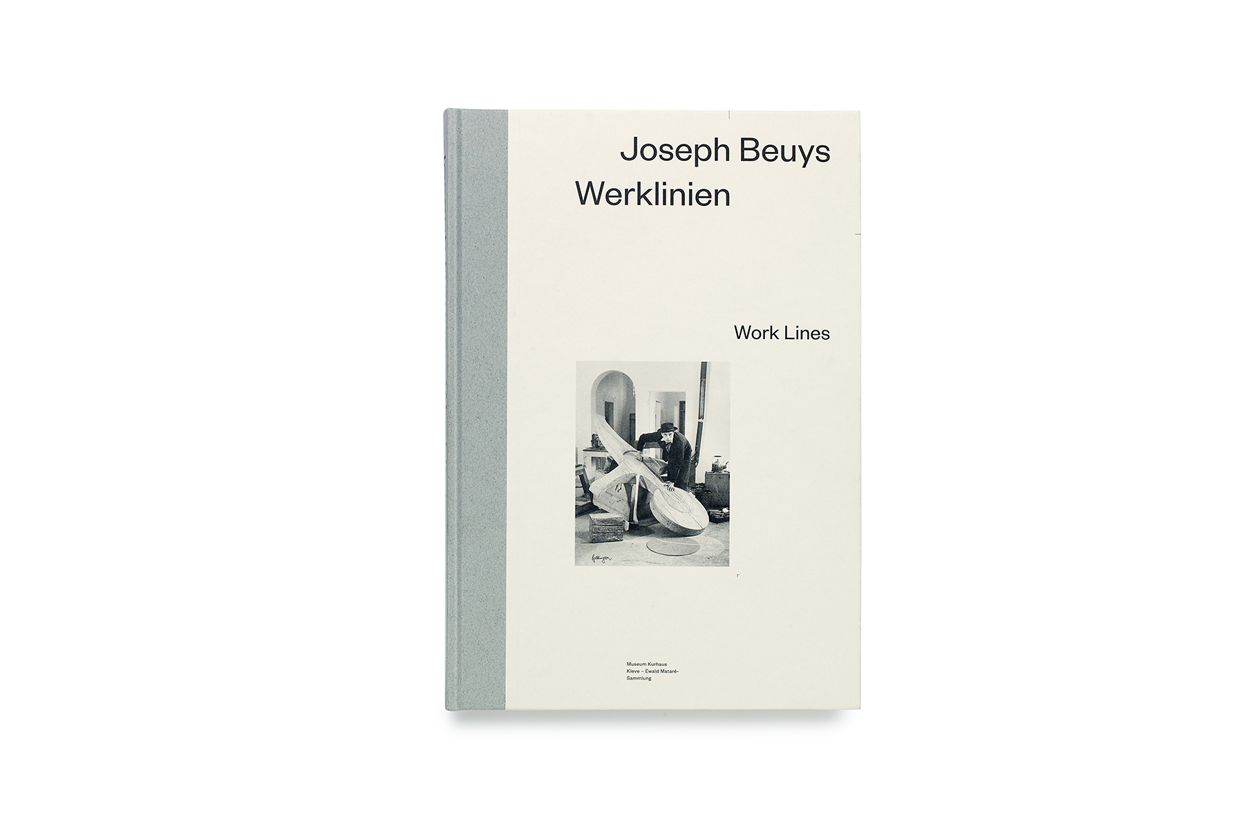
JOSEPH BEUYS. WERKLINIEN / WORKLINES
Gattung: Katalog / 2016
Auftraggeber: Museum Kurhaus Kleve – Ewald Mataré-Sammlung
Details: 200 x 290 mm, 288 S.

JUDITH JOY ROSS. LIVING WITH WAR – PORTRAITS
category: catalogue / 2008
client: Josef Albers Museum Quadrat Bottrop, Steidl
details: 240 × 300 mm, 164 pp.
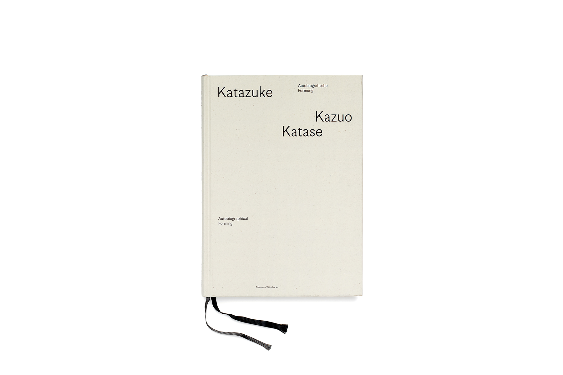
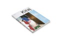
KAZUO KATASE. KATAZUKE
category: book / 2018
client: Museum Wiesbaden
details: 164 × 230 mm, 124 pp.
awards: German Design Award 2019
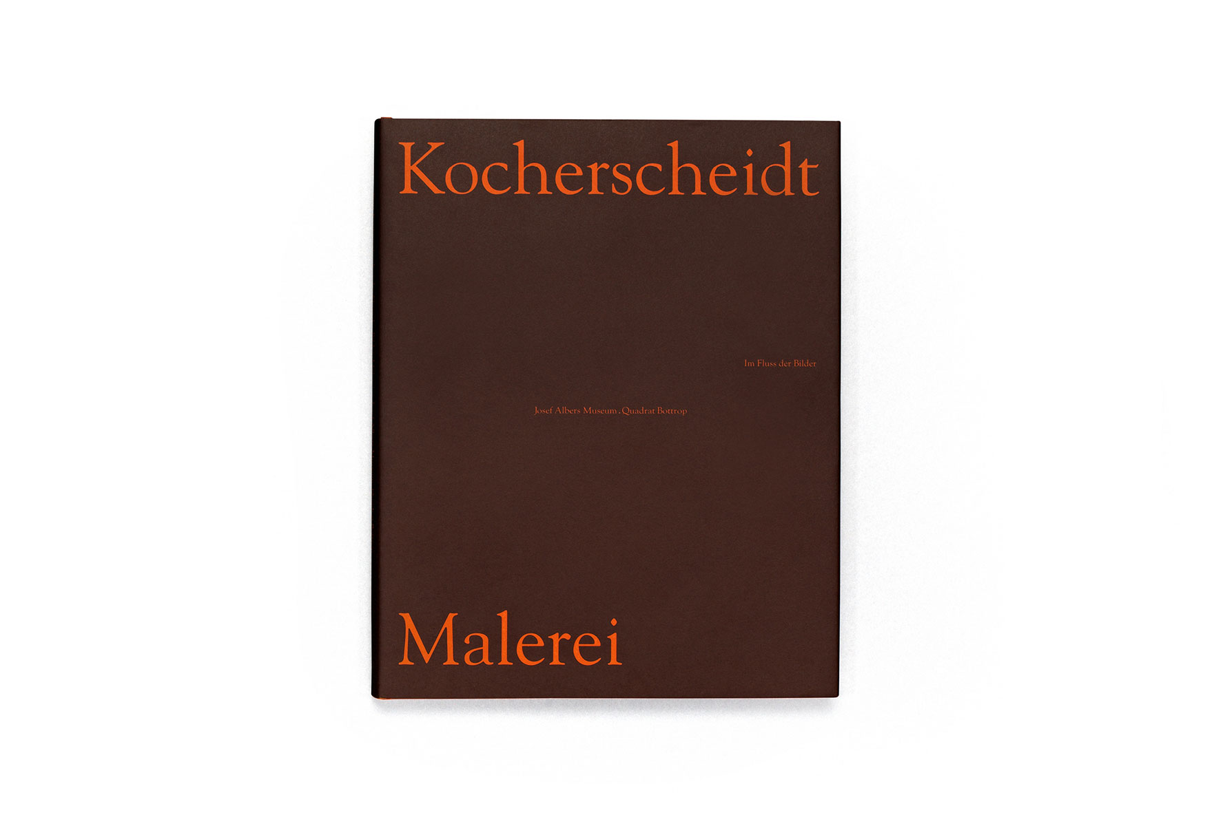
KURT KOCHERSCHEIDT. MALEREI
category: catalogue / 2013
client: Josef Albers Museum Quadrat Bottrop
details: 240 × 300 mm, 144 pp.

MARTINA SALZBERBER. ARBEITEN / WORKS
category: catalogue / 2005
client: Martina Salzberger
details: 116 × 160 mm, 248 pp.

MUSEUM KURHAUS KLEVE – EWALD MATARÉ-SAMMLUNG
category: visual identity / 2012 –
client: Museum Kurhaus Kleve – Ewald Mataré-Sammlung
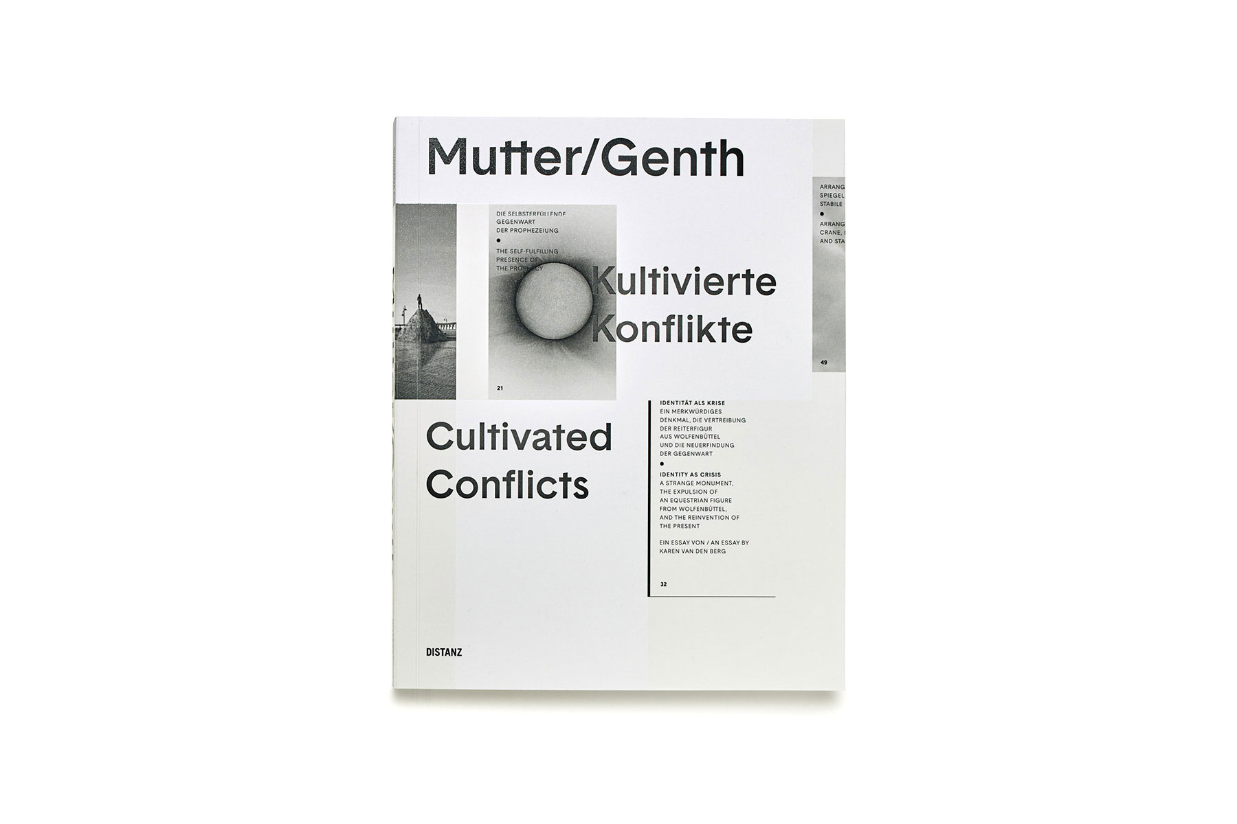
MUTTER/GENTH
category: catalogue / 2015
client: Heike Mutter und Ulrich Genth
details: 230 x 295 mm, 200 pp.

PEPE DANQUART. LAUF, JUNGE, LAUF! FRAGMENTE EINES FILMS
category: book / 2014
client: Pepe Danquart, Alexander Verlag Berlin
details: 165 × 240 mm, 120 pp.

PIA FRIES. MALEREI 1990 – 2007
category: catalogue / 2007
client: Richter Verlag Düsseldorf
details: 235 × 285 mm, 192 pp.
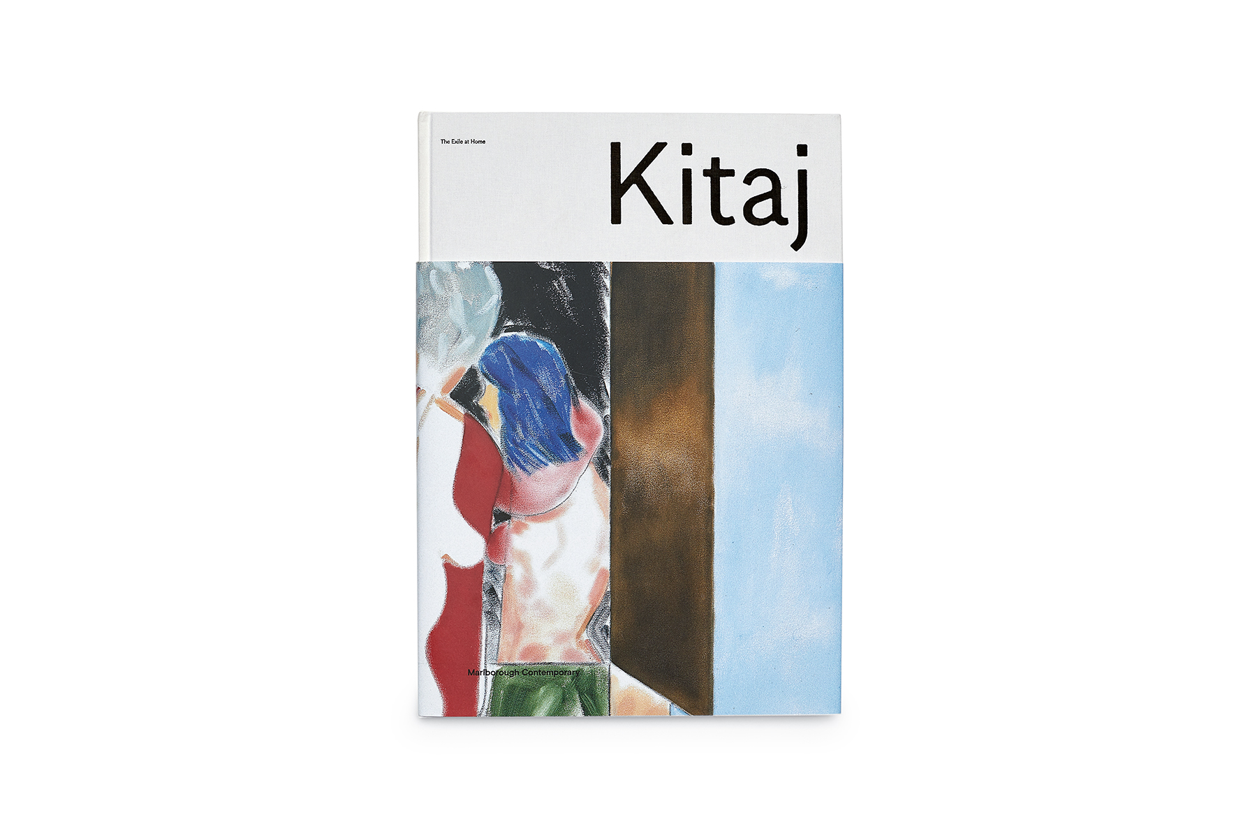
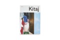
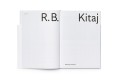
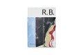
R.B. KITAJ. THE EXILE AT HOME
category: catalogue / 2017
client: Marlborough Contemporary
details: 240 × 340 mm, 92 pp.

STUDIO KATHARINA GROSSE
category: visual identity / 2004
client: Studio Katharina Grosse
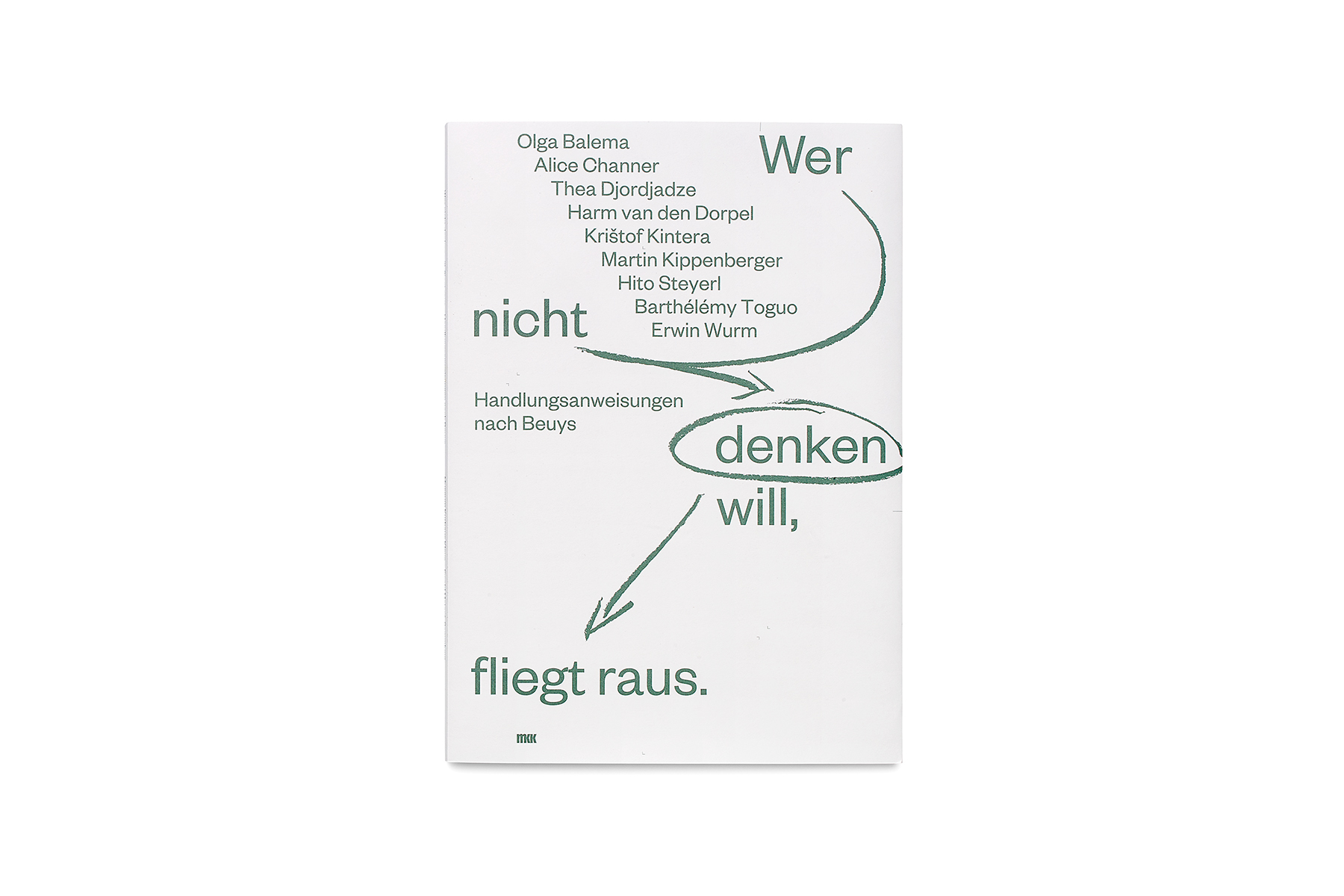
WER NICHT DENKEN WILL, FLIEGT RAUS
Gattung: Katalog / 2016
Auftraggeber: Museum Kurhaus Kleve – Ewald Mataré-Sammlung
Details: 218 x 305 mm, 68 S.
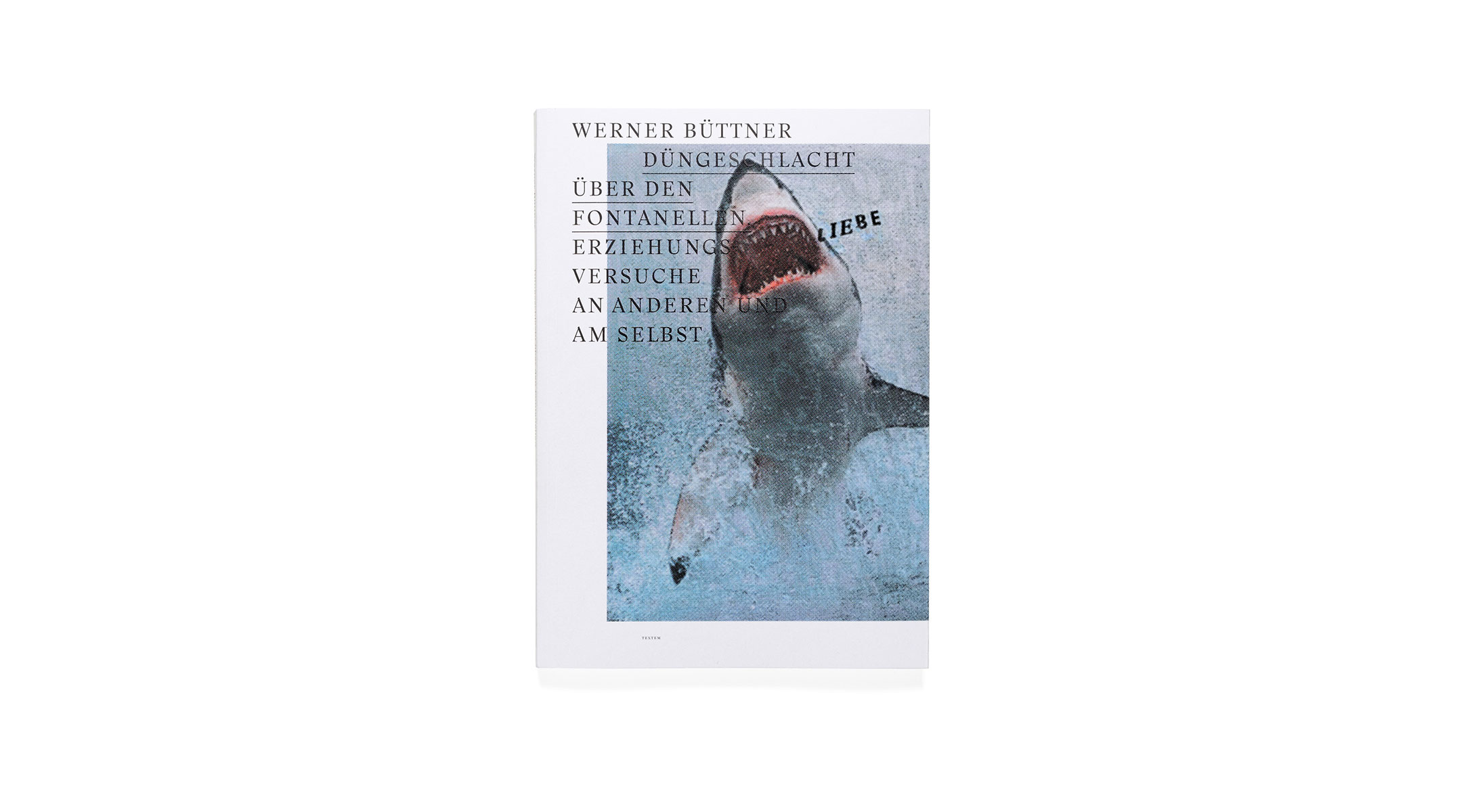
WERNER BÜTTNER. DÜNGESCHLACHT ÜBER DEN FONTANELLEN
category: book / 2014
client: Werner Büttner, Textem Verlag
details: 223 × 320 mm, 172 pp.

WERNER BÜTTNER. POOR SOULS
category: catalogue / 2016
client: Marlborough Contemporary
details: 228 × 326 mm, 96 pp.

WERNER BÜTTNER. SOMETHING VERY BLOND COMES TO TOWN
category: catalogue / 2019
client: Marlborough Gallery
details: 240 × 340 mm, 92 pp.
AHMED ALSOUDANI
category: catalogue / 2017
client: Marlborough Contemporary
details: 290 × 360 mm, 60 pp.
awards: TDC New York 2018


BASIC RESEARCH – NOTES ON THE COLLECTION
category: catalogue / 2014
client: Museum Kurhaus Kleve – Ewald Mataré-Sammlung
details: 218 × 305 mm, 64 pp.


BEVERLY PEPPER
category: catalogue / 2019
client: Marlborough Gallery
details: 240 × 340 mm, 76 pp.


CARL ANDRE
category: catalogue / 2011
client: Museum Kurhaus Kleve – Ewald Mataré-Sammlung
details: 216 × 270 mm, 152 pp.


DISHAMMONIA
category: book / 2019
client: Michaela Melián / Spector Books
details: 120 × 170 mm, 76 pp.


FRANZ GERTSCH
category: catalogue / 2015
client: Saarlandmuseum
details: 230 × 320 mm, 68 pp.


FRIEDRICH VON BORRIES. POLITICS OF DESIGN, DESIGN OF POLITICS
category: magazine / 2018
client: Die Neue Sammlung – The Design Museum
details: 232 × 328 mm, 160 pp.


FRIEDRICH VON BORRIES. POLITICS OF DESIGN, DESIGN OF POLITICS
category: exhibition graphics / 2018
client: Die Neue Sammlung – The Design Museum
Exhibition venue: Die Neue Sammlung – The Design Museum
details: exhibition design by Friedrich von Borries


GIUSEPPE PENONE
category: catalogue / 2019
client: Saarlandmuseum
details: 230 × 320 mm, 84 pp.


GOTTFRIED BENN. MORGUE UND ANDERE GEDICHTE
category: book / 2012
client: Klett-Cotta
details: 162 × 182 mm, 32 pp.
in collaboration with: Michael Zöllner
awards: Schönste Deutsche Bücher 2012


GOVERT FLINCK. REFLECTING HISTORY
category: catalogue / 2015
client: Museum Kurhaus Kleve – Ewald Mataré-Sammlung
details: 240 × 330 mm, 236 pp.
in collaboration with: Cyrill Kuhlmann


GREGOR HILDEBRANDT
category: catalogue / 2015
client: Saarlandmuseum
details: 230 x 320 mm, 160 pp.


HANS-CHRISTIAN SCHINK. HIER UND DORT
category: catalogue / 2018
client: Saarlandmuseum
details: 210 × 280 mm, 92 pp.


HEIKE MUTTER & ULRICH GENTH. METAREFLEKTOR LUFTOFFENSIVE
category: catalogue / 2006
client: Heike Mutter und Ulrich Genth
details: 210 × 330 mm, 56 pp.


HENDRICK GOLTZIUS & PIA FRIES. PROTEUS & POLYMORPHIA
category: catalogue / 2017
client: Museum Kurhaus Kleve – Ewald Mataré-Sammlung
details: 198 × 305 mm, 260 pp.
awards: TDC Tokyo 2019 Excellent Work


HOCHSCHULE FÜR BILDENDE KÜNSTE HAMBURG
category: book / 2017
client: Hochschule für bildende Künste Hamburg
details: 195 × 288 mm, 164 pp.


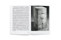


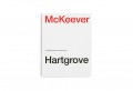
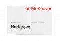
IAN MCKEEVER. HARTGROVE
category: catalogue / 2012
client: Josef Albers Museum Quadrat Bottrop
details: 230 × 290 mm, 156 pp.


INSIDE INTENSITY
category: catalogue / 2017
client: Museum Kurhaus Kleve – Ewald Mataré-Sammlung
details: 218 × 305 mm, 68 pp.


JAMES BISHOP. MALEREI AUF PAPIER / PAINTINGS ON PAPER
category: catalogue / 2017
client: Josef Albers Museum Quadrat Bottrop
details: 220 × 275 mm, 124 pp.


JERRY ZENIUK. HOW TO PAINT
category: book / 2017
client: Josef Albers Museum Quadrat Bottrop
details: 144 × 236 mm, 144 pp.


JOSEF ALBERS MUSEUM QUADRAT BOTTROP
category: visual identity / 2008 –
client: Josef Albers Museum Quadrat Bottrop


JOSEPH BEUYS. WERKLINIEN / WORKLINES
Gattung: Katalog / 2016
Auftraggeber: Museum Kurhaus Kleve – Ewald Mataré-Sammlung
Details: 200 x 290 mm, 288 S.


JUDITH JOY ROSS. LIVING WITH WAR – PORTRAITS
category: catalogue / 2008
client: Josef Albers Museum Quadrat Bottrop, Steidl
details: 240 × 300 mm, 164 pp.


KAZUO KATASE. KATAZUKE
category: book / 2018
client: Museum Wiesbaden
details: 164 × 230 mm, 124 pp.
awards: German Design Award 2019


KURT KOCHERSCHEIDT. MALEREI
category: catalogue / 2013
client: Josef Albers Museum Quadrat Bottrop
details: 240 × 300 mm, 144 pp.


MARTINA SALZBERBER. ARBEITEN / WORKS
category: catalogue / 2005
client: Martina Salzberger
details: 116 × 160 mm, 248 pp.


MUSEUM KURHAUS KLEVE – EWALD MATARÉ-SAMMLUNG
category: visual identity / 2012 –
client: Museum Kurhaus Kleve – Ewald Mataré-Sammlung


MUTTER/GENTH
category: catalogue / 2015
client: Heike Mutter und Ulrich Genth
details: 230 x 295 mm, 200 pp.


PEPE DANQUART. LAUF, JUNGE, LAUF! FRAGMENTE EINES FILMS
category: book / 2014
client: Pepe Danquart, Alexander Verlag Berlin
details: 165 × 240 mm, 120 pp.


PIA FRIES. MALEREI 1990 – 2007
category: catalogue / 2007
client: Richter Verlag Düsseldorf
details: 235 × 285 mm, 192 pp.


R.B. KITAJ. THE EXILE AT HOME
category: catalogue / 2017
client: Marlborough Contemporary
details: 240 × 340 mm, 92 pp.


STUDIO KATHARINA GROSSE
category: visual identity / 2004
client: Studio Katharina Grosse


WER NICHT DENKEN WILL, FLIEGT RAUS
Gattung: Katalog / 2016
Auftraggeber: Museum Kurhaus Kleve – Ewald Mataré-Sammlung
Details: 218 x 305 mm, 68 S.


WERNER BÜTTNER. DÜNGESCHLACHT ÜBER DEN FONTANELLEN
category: book / 2014
client: Werner Büttner, Textem Verlag
details: 223 × 320 mm, 172 pp.


WERNER BÜTTNER. POOR SOULS
category: catalogue / 2016
client: Marlborough Contemporary
details: 228 × 326 mm, 96 pp.


WERNER BÜTTNER. SOMETHING VERY BLOND COMES TO TOWN
category: catalogue / 2019
client: Marlborough Gallery
details: 240 × 340 mm, 92 pp.


Point of No Return: Point of Departure
“… All communication of the contents of the mind is
language (...) The existence of language, however,
is coextensive not only with all the areas of human mental
expression in which language is always in one sense or
another inherent, but with absolutely everything.”
Walter Benjamin
According to the Holocaust Memorial Museum in Washington: “The Holocaust did not begin with killing; it began with words.” This shocking statement serves to emphasise the significance of language: not only does it trigger actions, but it is itself a powerful form of action. To look at speech critically and even in the light of moral philosophy is thus essential to any enlightened and just society!
Whilst this is true of language using words, it naturally also continues to be true of visual speech – which, today, is significantly guided by graphic designers. Unfortunately, we find that no broad-based public discourse on this subject exists.
Graphic design occupies a key position in the communication activities of diversified and transnationally active societies. It is the arena in which the interpretations and translations that take place both within and between societies are developed and implemented. The responsibility that results from this cannot be expressed within the logic of any standardised working process. Criteria such as readability, ability to hold attention, contemporary qualities, originality, and signature style do not provide a sufficient basis for a critical discourse on the discipline. What is called for is an intensified (culturally) critical and transdisciplinary process of engagement and reflective thought.
If one reads the First Things First manifestoes of 1964 and 2000 it becomes plain that a disquietude regarding the power of graphic language – and thus a consciousness of what constitutes responsible graphic design – came into being at the same time as the discipline itself. The idea is that designers should not be compliant implementers of questionable content directed by the hands of others, but should instead operate in a critical and opinionated manner. 20 or 50 years later respectively, pretty much every graphic design website states that the graphic designers who are advertising their services operate in a wide-ranging field of progressive publishing, and that they are interested in a maximally intensive collaboration with the clients (thus, with society).
Naturally, this person is principally interested in others in generalised way, regardless of whether – or precisely because – this other is new, old, and/or unconventional.
It is generally stated that this person is interested in a genuine exchange, in exploring the unknown, in diversity – and consequently interested only in design solutions that, regardless of personal style, are precisely tailored to the content for which the design is required.
Mission statements of this type make easy, palatable reading. They sound earnest, distinctive, sensitive, in-touch, even modest, and the politically opportune tone of their wording contrives to imply quality.
However, when I look at the international uniformity (with heavy European emphasis) of the commercial mainstream – and this also applies to the avant-garde mainstream – I find myself asking how many laudable-sounding banal platitudes and how many implied claims are actually being presented here. In other words, what degree of manipulative whitewashing has now become “common sense” in the presentation of self and client, and how much analytical and critical consideration is actually being performed and implemented?
When I take a closer look, I find myself additionally asking whether these statements, which sound as if they are intended as a way of asserting quality standards, are ultimately nothing more than flowery descriptions of a procedure, quite possibly well-meaning but providing no standards for the quality or significance of an artefact or process. After all, Nazi graphic artists would also have researched and analysed to communicate in a pithy and relevant way. If the Nazi graphic designers – or those of the early Soviet Union – were compliant implementers of a totalitarian ideology, I sometimes ask myself: are we today not perhaps naive facilitators of a neoliberal egomania and arbitrariness?
The architect Hans Kollhoff writes that: “Before anyone can become an architect, he must become a citizen. He must not be satisfied with things as they are. Instead, through the way he constructs buildings, he must set an example of how things should be – in the best traditions of a civic citizen. This is truer than ever when traditional obligations are dissolving and becoming a question of taste, and, as Rüdiger Safranski states, bad taste is being given an easy conscience.”
Perhaps we should adapt the statement made by the socialist revolutionary Thomas Sankara, “A soldier without education is a potential criminal“, as follows: a graphic artist who does not think is a potential deceiver?
Peter Sloterdijk says that design is nothing other than “skilled processing of the non-skilled” and sometimes a “simulation of confidence” that helps “to retain a form amid that which disintegrates forms”.
In our modern world of products in which stable qualities no longer exist, design has the task of keeping the mechanisms of continuous surpassing and increase going, of keeping a permanent process of rejuvenation moving forward, with a fixed gaze. Additionally, the applied art of design offers modern mass society sufficient help in striking the right balance between dismantling and building up illusions: “Everyone should have access to the feelings of being a winner.” As mass “self-designing”, it provides “its smart wearers” with an “up-to-the-minute competencies bundle of tempo, information, irony and taste” – but with an associated corresponding recklessness.
Friedrich von Borries conceives of a different way of thinking about design: “Design is a Janus-headed discipline that can react swiftly and flexibly to changes in society or in the environment. It has a dual nature, belonging simultaneously to the world of art (with all its freedom) and the world of economy (with all its effectiveness). […] Design has the power to create positive pictures for the future, to make desires visible, to further emancipation and to develop concepts for how to implement a good life for all. The tension inherent in design between its roots in the day-to-day society and economy, speculative desire production and the power of the artistic imagination can produce an effective force that transcends boundaries and conceives new possibilities for the world.”
I want to use the Point of No Return symposium series to pose the question of how graphic design and visual communication operate within the tension that exists between all these factors. My intention is to bring together thoughtful and critical attitudes in the field of graphic design – artistic and academic – in order to expand, stimulate, and make public the voice of a critical discourse on graphic design. I am particularly interested in the specifics of graphic design as a phenomena, something that has been insufficiently illuminated in the design discourses of recent years.
Anyone wishing to exercise criticism must constantly ask themselves: what is, in fact, the object of my criticism? To exercise critical discrimination means to put things in context, to measure them, to weigh them, and to interpret them – criticism is thus a dynamic dialogue between how things are and how things should be in which each dialogue partner influences the other. In order to produce a constructive opposition, the first symposium, to be held today and entitled Point of Departure, will begin by addressing the things that must be taken into consideration by working designers, and by looking at the question of what graphic design today can do, and what it does in fact do.
The second symposium in the series, entitled Born in the Echoes and scheduled to take place on the 31st of May of this year as part of the German-language AGI conference (once again in Hamburg), will focus on an interrogation of graphic design by various disciplines of the (cultural) sciences. What do philosophers, and sociologists, psychologists, communication and politics scientists, literary scientists, art and design theorists make of – or with – graphic design?
The third symposium, entitled Keep it Hit and scheduled to take place in December at the Bauhaus Universität in Weimar, will enquire into critical praxis in relation to graphic design. What are the essential criteria for the work of curators, critics, and those commissioning design work? And what might be put in place in order to fuel a critical graphic design discourse of the future?
Finally, in early 2020, the symposium series will appear in published form, to be launched at the It‘s a Book independent book fair in Leipzig. In order to assure as broad a base as possible for our efforts to give greater voice to graphic design, this publication will include the voices of a number of further authors in addition to the contributors to the symposium series.
Ingo Offermanns, Hamburg, January 2019
Point of No Return: Born in the Echoes
What is good graphic design? This is a major question, and yet one that designers face routinely. Its continual everyday presence sometimes robs this question of its urgency – it is like a difficulty that a person has learned to live with, dealing with it smoothly and without thought. This is a question that is not new to us. It has previously been answered many times in a functionalistic/ideological manner, and, over recent decades, it has also increasingly been answered in a subjectivistic way. However, it is a question that must be posed by every generation, in all its urgency: answers are always context-dependent, and cannot be exhausted through the comparison of stylistic features and the checking of functionality. The question of what constitutes good graphic design implies pragmatic and moral qualities, and it must also respond to the context, task, object, process, and artefact of graphic design.
The philosopher Gerhard Schweppenhäuser suggests “that we do not take values as a referential framework [for this], because they change permanently, but their form, which remains constant. Instead of ‘good or bad’, the code of differentiation that we apply should be ‘correct and false’ or ‘fair and unfair’. [For this reason], the referential framework must consist of normative moral principles.” Schweppenhäuser demands that: “The communicative purposes that are realised with visual media must justify themselves under the principles of ‘self-determination in freedom’ and ‘equal rights of understanding’. Other criteria should not be recognised. Designers who consider ethics will discover that they are under an obligation to promote the cognitive and emotional abilities that we need in order to operate in an understanding-oriented way and with solidarity, and to consider the matter together in reflective discourse.”
The symposium Born in the Echoes poses the question of where and how such an attitude – surely one with which most designers can agree – expresses itself in graphic design. How can we recognise correct or just graphical design in relation to context, task, object, process, and artefact? And when is criticism appropriate, in spite of all well-meant assertions?
In my eyes, it is, in particular, important not to overlook the artefact. After all, it is the artefact that makes the content, parameters, and processes comprehensible – that is, accessible in sensory and intellectual terms. It is the reverberation and echo of these aspects. If sustainability in graphic design is to have a value, then this also means that the artefact also takes on a major significance.
But what should the criteria for determining quality be, given that they must go beyond simple questions of personal taste, strategic success orientation, and simple moral attitudes? What are the benchmarks for criticism, and where should they begin? What might serve as examples of correct and just graphical design and artefacts, or as examples of the complete opposite?
In my introduction to the opening of the symposium series Point of No Return, I said that one can read on pretty much every graphic design website that the graphic designers that advertise themselves on these sites operate in wide-ranging areas of enlightened publishing and are interested in a maximally intensive collaboration with their customers (aka society). Everywhere, the presumption is that what people are interested in is genuine exchange, in researching the unknown, in diversity, and consequently, only in design solutions that are independent of personal style and precisely tailored to the context that is being designed for.
Mission Statements of this type make easily palatable reading. They sound earnest, differentiated, sensitive, worldly-wise, even humble, and the politically opportune sound of their words somehow suggests quality.
When I look at the heavily European-influenced international uniformity of the commercial and the hipster mainstream alike, I find myself asking: how many generalised platitudes that sound good and how many assertions loaded with implications go along with this? How much manipulative whitewashing in the presentation of self and art? Or, in the spirit of Sloterdijk, how much simulation of confidence and solidarity has now become common sense? Also: to what degree is critical thought actually practiced and implemented?
As someone who works exclusively in the cultural scene, I also find myself asking: it is enough to work on morally opportune content for morally opportune clients, so that one never has to shine a critical light upon one’s own way of operating in design?
In the graphic design content, expressing these thoughts often leads to irritation. But what is at the root of this irritation? Is it because there is little tradition of this kind of thought in graphic design and design theory? Is it founded on the fact that this thinking is an overreaction, has little to do with the real world, and is of interest only in academic circles? Is the social significance that I am alleging for this discourse perhaps not justified in the case of an activity that is understood as a subordinate means to an end, something that is not in itself the cause of anything, but is primarily directed by outside agencies and is strategically deployed to create effect? Ultimately, do people suspect that this is an arrogant elevation of what we do?
In the symposium series Point of No Return – as with the open letters to the Stiftung Buchkunst that I have published jointly with Markus Dressen and Markus Weisbeck – if I argue for an increased capacity for speaking within graphic design, and for negotiating and disputing the criteria of what critical graphic design action is, then it is not because I am concerned with academic hair-splitting or greater cultural sophistication. Instead, it is about making people conscious of a reality described by the literature scientist Albrecht Koschorke thus: “Cultural symbolisations are for their part actions in the field that they symbolise. They do not record social conditions like passive measuring instruments. Instead, they change those conditions (to a greater or lesser extent). The relationship that prevails between social facts and their cultural representation, between object and concept, is thus not ‘cold’ and objective, but is a potentially ‘hot’, circular relationship.”
This interdependency and interweaving of visual communication and society reveals that neutrality in graphic design is an illusion, and that subjectivism is a questionable strategy. Thanks to their social function, communication designers are among the first people to come into contact with experiences of intercultural exchange and the associated values conflicts. In her article for the Lerchenfeld, Eva Linhart, curator at the Museum Angewandte Kunst Frankfurt, speaks about the responsibility that goes hand in hand with this: “Graphic design, in its interaction between many specialisms and in its dependency on a series of new technologies and media, permeates all areas of life today and, since the digitalising of communication, it is the premier information, and imagery instrument of our society. […] If autonomous art connects with life only in an exemplary fashion, as an aesthetic transmission service from the detached space of the White Cube, graphic design’s natural home is in real-life praxis. In this context, it operates in an immediate, context-dependent, and multifarious way. This makes it all the more urgent that we should consider its effect, if it is not to be received in an unconscious manner.”
The interdependency and the interweaving of visual communication and society makes graphic design a constituent element of the public sphere – a value that erodes as society disintegrates into singularities. Interestingly, visual communication is in fact an integral part of this disintegration; not only does it support the dialogue activity of the public audience, it also supports the monologue activity of the cutthroat competition for attention – in other words: social exclusion. Might considering the audience in a spirit of solidarity be a desirable quality of graphic design?
But what does open graphic design look like? How does dialogue-based and solidarity-based participation in the public communication shaped by graphic designers function? How can this participation be given a graphical form that is more than just the smallest common denominator of strategic goals, particular interests, and subjective conditions?
Without wishing to anticipate the subject of the discussion, I find myself asking whether, along with remembering the public audience, it might not be just as important to discuss the expansion and reconquering of the public audience? After all, as Christian Bauer quite rightly remarked, whilst communication designers can certainly be trusted to act in a purposeful and profitable manner in line with the expectation of the market and of competition in the working field of audience effectiveness, a question remains as to possibilities “for providing an (imagined) audience that is not necessarily primarily composed of commission givers and other market participants with appropriately knowledgeable and public information on ‘the impropriety or unjustness’, that might take place in the fulfilling of commissions.”
How widespread this view has become was made particularly plain by Matthias Görlich’s contribution to the previous symposium, in which he asked whether the graphic designers of today are in fact still responsible for the graphic design of our societies, or whether this is in fact performed by other forces, with the graphic designers simply providing a trendy figleaf?
Does this mean that the discussion should be about the remembering of public audience dialogue on the one hand, and the expanding and reconquering of effective and interpretative power in this public audience context on the other?
Eva Linhart writes: “It is the responsibility of the whole of society in a civil society to penetrate the knowledge of the ability of the complex and power-constituting effective contexts of graphic design, if we as consumers are not to be solely those seduced by its effect.”
In the symposium series Point of No Return, I want to ask where the forming of theories for graphic design should begin and how concepts and criteria might be developed and differentiated, in order to provide an orientation for the qualities that should characterise critical design activity.
In the first symposium, Point of Departure, which will take place at the end of January, we have addressed the thoughts of active designers and posed the question of what, from their perspective, graphic design can achieve today, and what it does. Referencing Friedrich von Borries’ publication Politics of Design, Design of Politics, this discussion produces thoughts on lines of action such as how graphic design articulates, reproduces, questions (or challenges), opens up, empowers, comes up with concepts, and mediates. In the publication accompanying the symposium series, this list is expanded in order to provide space for as many perspectives on graphic design activity.
In the second symposium Born in the Echoes, my aim is to discover what thoughts on the questions being considered here might be offered by the scientific angle. In doing this, I feel that it is important not to ask questions solely within art and design theory, but also to incorporate philosophy and social, communication, and media sciences.
Finally, the third symposium Keep it Hit, which will take place at the end of the year at the Bauhaus Universität in Weimar, will look at critical praxis in relation to graphic design. What are the significant criteria in the work of curators, critics, and those who give designers assignments?
Ingo Offermanns, Hamburg, May 2019
Questions of Attitude
In connection with the symposium “Point of No Return: Point of Departure”, the Lerchenfeld editorship team spoke to Professors Ingo Offermanns, Christoph Knoth, Konrad Renner, and Friedrich von Borries on the relationship between content and form, the lack of public discussion, and vanity in graphic design.
Lerchenfeld: During the symposium, I was struck by how often the question of evaluation of graphic design was transferred to the client or to the content – especially by the wider public. It is as if “good design” were only possible with “good” clients. However, this would mean that, conversely, graphic design is considered purely as a service. How can this be overcome?
Ingo Offermanns: This is a reaction that I have often observed at graphic design symposiums. It essentially reduces what a designer does to handwork. This is precisely the area in which the symposium series “Point of no Return” tries to do things differently. I can’t understand why a graphic designer wouldn’t develop the same identity as an orchestral musician or a conductor. They are presented with a material that already exists and must develop their own interpretation of it. And this is then discussed in the culture pages. Of course, the interpretation without the underlying content is unthinkable, but ultimately it all comes down to the interpretation. That is the place that I want to reach with the graphic design discourse.
Konrad Renner: In a discussion like this, I find myself thinking of the remarkable essay “Fuck Content” by Michael Rock from the year 2009, which can be read on the website of the New York studio 2x4.org. This essay is a continuation of one of his previous texts, and is concerned with the compulsion towards/ the need for authorship on the part of the graphic designer – both visually and in terms of content. At the time, as a young student, I felt – as did many other graphic designers – that this essay described the great potential of graphic design. Rock does this by comparing the graphic designer to a film director: “A director can be the esteemed auteur of a film he didn’t write, score, edit or shoot. What makes a Hitchcock film a Hitchcock film is not the story but a consistency of style, which winds intact through different technologies, plots, actors, and time periods like a substance of its own. Every film is about filmmaking. His great genius is that he is able to mold the form into his style in a genuinely unique and entertaining way. The meaning of his work is not in the story but in the storytelling. Designers also trade in storytelling.” I like to recommend this essay in connection with these discussions. It shows how big the adjusting screws are for graphic designers; quite possibly, we are no longer aware of them in our day-to-day work, but they are, above all things, connected with form.
IO: I wouldn’t go so far as to describe the graphic designer as the equal of the author. Without the author, I would have nothing to do. Thus, in every case, I see myself as serving the content entrusted to me. But to translate it simply like a piece of handwork would be soulless, and thus in my eyes false.
Lf.: But isn’t the idea to develop a graphic design discourse that exists independently of the content?
IO: In my view, it can’t be treated as independent. The content, the external factor, always provides the basis and the frame of reference. But its translation and/or interpretation allows a great scope for authorship which can confront the given content in an autonomous way. After all, any kind of content can be interpreted in a number of different ways. It may be implemented in a historicising or contemporary, ironising, subjectivistic or distanced way etc. Once one is sure of one’s mastery of graphical techniques, the discussion immediately moves to one’s interpretative attitude – revealed, for instance, in their struggle for simplicity, harmony, deconstruction, absence, or some other quality. This is the right level for graphical authorship.
KR: When I am asked to describe what I do as a graphic designer, then I usually describe it in this way: something is standing in a dark room, and we have a torch that we can use to illuminate it. How we illuminate it – from the front, or from behind – is a decision that is left up to us. But we do not primarily have a great deal to do with what is actually standing there. We have no influence on it. If there is nothing standing there, then we can’t illuminate anything.
Friedrich von Borries: You can overcome the dichotomy of the commissioner and the commissioned in the moment in which you yourself become your own principal.
Christoph Knoth: In that moment, the designer becomes the author. The two sides come together. You can explore things in your own way, and you are free to change the content as you wish. Your aim is to express yourself as a designer, and you also develop the content. At this point, there are no dependencies. In any case, this motivation exists as well.
IO: What you are describing is in fact the type of authorship for which students are educated at a university of the arts. They are taught critical distance, a contextualising of themselves, and a questioning of the relevance of the expression of the content. This is in contrast to classical graphic design universities, where authorship is often equated with the plain and simple living-out of personal preferences, producing graphical fetishes rather than content. This is also the reason why it is so important for graphic design to be taught at art universities, as authorship is indissolubly part of design (although the amount of space that it is given varies), and exercise of the critical faculties is required in order to operate responsibly in this arena.
CK: Even in the cases in which the graphic design and the content are closely linked, I can also tell a story using visual means that runs “in parallel” to the content. After all, I do not always have to reflect the content in every point. I may be able to achieve far more attention with a different narrative. Of course, there are also situations in which I must develop a graphic design without actually being familiar with the content. For instance, I might have to create an announcement website for a festival; possibly I know who is going to be involved, but of course I do not know precisely what will happen there. In some circumstances, my draft may promise far more than the event ultimately delivers.
IO: That is a good example of the extent to which assertion is a part of graphic design. This is particularly true when you are developing a visual identity for an institution or an undertaking. Even when it is undertaken under conditions of intensive dialogue with those responsible, this context offers a great deal of free scope for the graphic designer in terms of the design – and the content composition is sometimes a single assertion.
Lf.: In order to develop a visual identity or communication strategy for institutions or firms, the graphic designer becomes almost an adviser. It is not unusual for this to go beyond a purely design perspective. What are the distinguishing characteristics of the graphic designer’s perspective on these processes?
CK: I believe that the really special thing is offering the institution or person individual solutions. That is what can’t be generalised.
KR: In the past, we used to start a new project by sending a questionnaire to the institution. We would ask: who is associated with the project? Where is it headed? What is the story that we are actually trying to tell? Ultimately, who makes the decisions? Aside from the purely technical questions, this never actually achieved anything. The answers were invariably so non-specific that they might have been the answers of any institution. Direct dialogue is more interesting and productive if we explore the extremes – by presenting drafts developed in opposing directions. One can then adopt an attitude, a position. The interesting conversation cannot take place until it becomes visual. All of the thinking that is done up to that point is purely writing. Once again, assertiveness is a part of the work.
IO: I ask the participants to bring something with them that they themselves like. Words are often too flexible, and the visual cannot always be connected with language. It is easier to work on something concretely visual. At the same time, however, I begin working with my analytical gaze from the external perspective, paired with a high degree of emotionality. Precisely because the developing of identity is already at an advanced stage, it is difficult for participants to preserve a constructive distance. This is why the term “anamnesis” is appropriate; it describes the process in which physicians endeavour to discover the origins of particular feelings through a combination of intellect and emotional understanding.
CK: In this case, we are talking about a kind of visual anamnesis.
IO: In the discussion, in the conversation, you have to develop a sense for the facets of an institutional identity that ought to be exposed, constructed, or shown. Ultimately, it is after all emotional configurations that must be translated into visual language. To say it in a rather kitschy way: ideally, you fall in love with the content. This gives you a sensibility, a devotion and forgetting of the self that enables you to get a feeling for the potential of what you are faced with.
CK: I would go further than that. I think things are most interesting when we surprise ourselves through the design process. When we seemingly make a mistake or we do something which we cannot immediately explain, but which ultimately leads to a solution or a new perspective on the theme. For me, these are the most exciting moments.
FB: I would like to pick up once more on this theme of commissioning work from yourself, tied to the theme of identifying with the content or “falling in love” with it. A designer can also choose his clients – for instance, a civic agency or social group that is not receiving enough attention for its concerns. In this case, one does not have to develop the content oneself. But one can place one’s abilities as a designer, moderator, and adviser in the service of a matter that one considers to be important. I consider this to be a very exciting way of reversing the “relationship” with the supposed “providers of services”.
Lf.: So, you can only develop something like that if you have a personal connection to the content? But what do you do if your attitude to the content is essentially critical? This brings us back almost to the point at which this conversation started: can one work for Alternative for Germany?
KR: These are important orientation questions. This is also evident in the students’ questions. Art universities are the biggest world improvement institutions in existence. This is very important: where else can one still think and act in such a free and autonomous way? But how about what I do afterwards? How do I apply it to my professional praxis? Where do the boundaries lie? What selection of works should I take on for the portfolio, and what should I take on to actually earn money? What am I willing to put up with for the sake of all the things that one needs in order to live today – or believes that one needs? When we receive new enquiries, we ask whether we can work with the institution or person or not. Is the content acceptable? Is there a space that might open up there, or is it hermetic? Naturally, we ask ourselves these questions, and we also discuss them with other designers. They are undeniably a factor. Possibly, we should consider being able to choose the people with whom we work as a luxury.
FB: I wouldn’t describe it as a luxury, it’s a fundamental requirement. It is important to cultivate a capacity for decision-making. For what causes do I wish to make my creativity available, and why? In the triple bind of economic circumstances, personal circumstances, and higher goals, what compromises am I willing to make? This has to be reconsidered for every project.
IO: However – as Christoph has already said – it is precisely those projects to which one does not easily feel a connection that are often the most exciting, because they help you to overcome cherished certainties and to expand your own voice. Things can become bad if you approach the content in a cynical way. This is comparable with a documentary filmmaker that presents its protagonists. That simply doesn’t work. If you do it, then you must do it with dedication and respect. Even if a certain distance remains. Cynical presentation by exposure I consider unacceptable. And, incidentally, the same is true of anything goes. What began as an exciting postmodernist experiment relative to still-existing values has now degenerated into a purely self-referential whateverism. There we are in the middle. And that is the reason why we try to fight for values: so that attitudes can be recognised and acknowledged in discourse. That is our responsibility.
Lf.: What do you hope will result from the symposiums? Particularly with reference to the Stiftung Buchkunst.
IO: It is my hope that there will be real conflict and real struggle. And also that the discussions will focus on questions of attitude – on the content that derives from designers. What happens in most cases is nothing more than verbal pats on the back. I would want us to really get to grips with graphical artefacts in a critical way. Not on the level of handwork – the way the Stiftung Buchkunst does it – that is far too anachronistic. Recently, I read an article about automobile design. Interestingly, it coupled aesthetic analyses of design with current researches on driving behaviour. How, for instance, increasingly aggressive automobile design affects driving behaviour. This is an interesting approach, seeking to contextualise and to relate insights to one another. The fact that the wheels on the cars must turn is a technical condition, just as it is an essential condition that pianists must have professionally skilled hands. Why is graphic design discourse unsuccessful in looking beyond the horizon of immediate handwork concerns and creating these kinds of connections? After all, doesn’t it work that way in architecture or in fine arts?
CK: An institution like the Stiftung Buchkunst, one that aims to communicate graphic design and makes it the focus, must constantly renew itself and ask questions. Above all, it must connect with social changes. Only by doing this is it enabled to judge what design is currently relevant to our society or interesting. I believe that it is only when an institution is capable of this kind of reflecting on itself and does not proceed according to an established catalogue that has been repeated down the years that it can become an important agent.
KR: Does this perhaps also have something to do with vanity, or with its deconstruction? The way I see it, vanity makes it much harder to talk about design.
IO: To be perfectly honest, there are no people working in our discipline who truly lack vanity. This is an area in which I must take a critical attitude to myself, also. But once you know that, you can and must work with the deficit in a constructive way. But my feeling is that precisely the opposite happens at most graphic design symposia: one is bombarded with displays of ego (portfolio presentations) which are not concerned with content, questioning, or criticism, but with assertions of power within a professional field with the aid of refined presentation techniques. Thus, in my eyes, we are dealing with a structural problem whose effects extend beyond the Stiftung Buchkunst. I truly hope that our work can do something about this.
Lf.: You have mentioned a number of aspects that you consider important in a graphic design discourse of this kind: lack of vanity, reflection on oneself, and a quality of questioning oneself. What else is needed?
FB: Even if it is foolish for me as a theorist to say this in a roundtable discussion: it would be good for something like a theory to be developed. Free art has a far higher consciousness of theory and method than design disciplines. Unfortunately, this is also the case among students.
IO: I have to agree with that! In the symposium series “Point of no Return”, I therefore try to promote the formulation of such a theory by bringing together all actors – which, i feel, automatically includes the sciences.
KR: There must be humour. With graphic designers, this is also something that cannot be taken for granted. You also have to be able to laugh at yourself. In recent times in particular, graphic design has increasingly been seen as a competition, and also practised as if it were. Particularly among young designers. This brings with it a very particular form of language, which can be thoroughly brutal and oppressive.
CK: Design is also becoming more brutal.
KR: Of course, this is also translated into the form. It is just the same as with the automobile design analogy.
CK: In this context, competitions play a not insignificant role. When we started out, we took part in many competitions – something that was surely partly down to vanity. It is equally sure that one of the privileges of having reached a certain point in one’s career is that one is no longer dependent upon having to do this. From this vantage point, one also sees that the jury always contains the same 20 people, and that in the end their students get the prizes. This applies, for instance, to the prestigious competition “100 Beste Plakate”, in which we participated in the past. Last year, there was a great public outcry because the jury was exclusively male. Previously, the ratio had been perhaps four or five to one. This year, in response, an all-female jury was assembled. This has also led to a change among the people receiving the prizes. 36 percent were women, whereas previously 30 percent had been. Thus, there has been some change.
Lf.: How do you reflect ways of talking about design in your classes? How do you convey a sensitivity for language to your students?
IO: My classes give plenty of space to analytical enquiries into design using word-based language. But I also assert that one must do this cautiously, as “technical” word-based language can also stand in the way of political (or visual) power. It can lead to pseudo-predictable or schematic graphical expression. It is therefore necessary to find a balance between enthusiasm for, experimentation in, expansion of, understanding of, and analysis of language (both linguistically and visually) so that the different modes of speaking and acting can cross-fertilise.
KR: In discussions, our students constantly use terms with a specific buzzword character, such as “That is so 90s” or “That looks like default design”. This creates a certain mood, but it is generally unclear what precisely lies behind the terminology. It is unclear what the background is, what its elements are and what is being quoted. If someone uses one of these expressions in our class discussions – the participants are a mix of Bachelor and Master students – we have become accustomed to asking for the specifics, and whether everyone knows what it means or what is meant by it. It is very difficult to define such terms in one’s own words.
FB: This is precisely what I mean by awareness of theory and method. Actual knowledge instead of phrases.
CK: These words are frequently placeholders for actual visual objects that one has in one’s head. But when one does not have these pictures before one’s eyes because one has only just started one’s studies, then it is difficult to talk about them. At the HFBK, as at many other universities in Germany, little information is made available on the history of graphic design. There are seminars on art history, and on industrial design history. But it is very rare for information to be provided in a comprehensive and historical way concerning all the things that surround us visually – from classical posters to the Internet. This means that it is also difficult to talk about these things. On the other hand, it is of course also about the students finding their own voice. Their own voice, which they bring with them as a person, is something that they must translate into visual form, into graphic design. Ultimately, that is the most important thing.
IO: I think that “voice” is the correct expression in this case, rather than “style”. I like to use a musical analogy: the repertoire of the most renowned jazz musicians – such as John Zorn – is frequently wide enough to include standards, film music, and experimental music. They exercise this wide artistic range in a variety of bands, and are celebrated for their mastery of so many languages: there is an expectation that their own voice will be recognised in this diversity of musical expression. This is not about vanity, but about revealing one’s approach. What has always impressed me about this is the diversity and inclusiveness of the artistic expression involved. This is a critical difference from the concept of “style”, which usually appears to me to be a narrow monologue, a monotonous response to one’s environment.
FB: I believe that the best way of giving this kind of voice full expression is to understand why and how others have deployed their voices and let them ring out. This, however, is weary work. When I offered a seminar at the HFBK on the designer Otl Aicher (1922–1991), the graphics students did not pack the room out. There was a certain lack of a culture of theory-related reflection. You said, rightly, that we do not teach the history of graphics – like many other universities. This is, of course, true, and I also see it as a problem. On the other hand, who writes the history of graphic design? The most interesting thing about design theory is that many of those involved are themselves designers who take the trouble to conduct research and to write. The same applies to architecture. In graphics, this is different. I don’t know why. Possibly because graphics is a rapidly changing medium, and one that changes ever more quickly.
Lf: How does one bring these discussions to a wider audience? Why isn’t graphic design discussed in the culture pages, for instance?
IO: This is also part of the problem. If you find design criticism anywhere, you find it under “style”, (incidentally, this is also true of architectural criticism). But never in the culture section. Graphic design never appears there.
CK: Does that bother us because it hurts our vanity?
IO: Quite possible. However, I am not interested in basking in the spotlight, but in using the platform. Being heard also means placing emphasis. And graphic design has a greater effect on our everyday lives than virtually any other design discipline. There is a discrepancy in public and media perception. Still, this is our own fault. If the world of graphic design continues to cultivate the communication forms already described, and does not adopt an offensive strategy of critical reflection, then that we shouldn’t be surprised that journalists do not take an interest.
CK: There are either the industry magazines, such as the Page, or underground magazines that are so underground that they don’t want to talk about graphic design. The Dot Dot Dot Magazine (2001–2011) was an example of this. Still, perhaps these aren’t the places where these discussions take place today? People operate on Twitter, Instagram, and Facebook feeds, which they assemble for themselves. If you follow graphic design and have some thoughts about it, this is your arena for reflection.
IO: But then we simply find ourselves dealing once again with those very problematic instances of self-referentiality, this relating only to the self in perceiving and in interacting with the world. This is a phenomenon that I increasingly see occurring in the cultural context as well. Very little historical and social contextualising is taking place. It is being replaced by peer group formation, which is rubbing up against the formation of echo chambers in an ever more dangerous way.
CK: Unlike graphic design, however, the mechanisms of social media are currently being very prominently discussed. For instance, there is the question of dependency, or whether user numbers are increasing or decreasing. At the same time, the fact that these always involve graphic design decisions is entirely neglected: what does the feed look like, and where are the buttons to ensure that I click on them as often as possible? Today, screens are thoroughly designed. They control our decisions and cause us to sleep badly and spend several hours a day in front of them. But this is not discussed from an aesthetic point of view. And yet, in the end, this is all created by graphic designers working with psychologists, scientists, and algorithms. People discuss useability, interaction, and social implications, but not aesthetics. There is no discourse on this subject.
Lf.: Is it enough simply to identify this, or would one have to go to these firms in order to make things better?
CK: I think it should be a question of developing alternatives. It is time to develop other kinds of platforms and apps.
IO: This kind of manipulation doesn’t only happen in Silicon Valley. The “old” economy is no different. Even the major museums – the flagships of sociocritical attitudes – increasingly operate like large neoliberal companies where graphic design is concerned, thinking solely of economics, predictability, workflow, availability, and brand building. At best, they are concerned with graphical quality on the level of a trend. I see this as a manifestation of a highly problematic double moral standard with regard to design relative to artistic expression.
CK: This also has to do with a lack of public attention and a lack of discourse on graphic design, in a kind of feedback loop. The people who make decisions in these major museums are dissociated from discourses, and are drawn in by the large agencies. This has to do with the general state of education about graphic design. It is therefore essential that the discourse be conducted in a more broadly-based way.
FB: But where will the discourses on “manipulation” then be conducted? They have to emerge out of graphic design itself and be conducted at symposiums, in teaching events, in self-designed magazines and blogs. Or on Instagram, as ever. We can’t wait for the culture pages or for “the” graphic theorists. Graphic designers must initiate these discourses themselves – perhaps this will cause them to be seen as “graphic theorists”.
IO: Friedrich is absolutely right there. The impetus for discussions must come from graphic designers at least as much as it comes from scientists. After all, we are not zoo animals guided by instinct. On the other hand, thoughts on flight should not be left (exclusively) to ornithologists. In the second symposium “Born in the Echoes” on the 31st of May 2019, I want to respond to what has been said. After the designers have taken an analytical look at the discipline in the first symposium, philosophers, sociologists, political scientists, and design theorists will be able to speak, taking a look at graphic design from the perspective of their own discipline.
Hamburg 2019
The case against “the beautiful (German) book”
Design is always political. It would be irresponsible to think of graphic design today as any different, because (graphic) design influences our hyper-mediatised day-to-day lives more strongly than practically any other aesthetic discipline.
In view of capitalist appropriations and an increasing populist distortion of language and communication, graphic design in general and book design in particular must be an arena of differentiated aesthetic action: it is an integral part of our language and writing culture, an arena within which social transformations are developed and implemented. The interplay between action, testing, and application describes an open process that calls for experimentation and pragmatism in equal measure. To think of book design in a primarily affirmative way and in terms of commercial exploitation is an inappropriate and irresponsible act of narrowing. After all, aesthetics criticism goes further than any marketing strategy. Thus, there is a need for a forum to promote and propagate this central aspect of critical/aesthetic cultural activity.
The Stiftung Buchkunst aims to be such a place. However, if one reviews the Stiftung’s work over the past few years, one inevitably has the impression that the Stiftung misunderstands “the beautiful book” as a marketable edification accessory with the potential to yield good returns, whilst systematically obscuring the national and international discourse of critical book aesthetics. In short: the Stiftung Buchkunst operates like a national interest group for the printing and publishing industry, not like an institution that promotes culture and is conscious of culture’s best interests, intended to reflect vibrant book art and book design discourses.
As the signatories of this open letter, we thus wish to argue for an alternative and transnational discourse on the aesthetics of books within and outside of the Stiftung Buchkunst that reflects the wide spectrum of reflection and innovation in book design and also reflects artistic experimentation – regardless of whether it takes place in the context of the market, in cultural institutions, or in universities.
This means that we need panels of judges that do not demarcate these different contexts in hostile and hierarchical terms, but instead can detect outstanding book design and bring it into the discussion. If this type of approach cannot be established within the Stiftung Buchkunst, then we call for an alternative institution concerned with the discourse of book art, which can work shoulder to shoulder and on the same level with international juries.
Ingo Offermanns, Markus Dreßen, Markus Weisbeck, Hamburg, August 2018
Translation and Resonance
I
Apparently, contemporary (graphic) designers can be almost anything in our societies. Here’s a list, of possible self-conceptions brought together by John Caserta:
The designer as producer editor, printer, curator, conductor, interviewer, social activist, revolutionary, leader, mayor, ambassador, mediator, librarian, stylist, data visualizer, organizational consultant, dilettante, algorithm generator, forger (falsifies documents), forger (melds metals), linguist, talk show personality, educator, restaurateur, ecipe collector, entrepreneur, CEO, COO, C3PO, futurist, bullshitter, importer, mob boss, brick layer, naturalist, journalist, clown, con artist, graffiti artist, degenerate, religious leader, pun writer, namer, fundraiser, decliner, thinker, dramatist, therapist, life coach, parent, armchair quarterback, backseat driver, wanderer, investor, listmaker…
This list claims a great potential of design for society, and looking at the core skills, that we are trained in – interaction, analysis, organisation, visualizing, enhancing, translation and empathy –, there is some truth in it. Though, I have doubts about it, since the undercurrent of this list is a form of vague abstraction, that runs into the danger of being nothing more, than whateverism. Because it says, that any thoughtful, empathic and stimulating interaction with people and society is design. Only, that this also works for politics, this also works for economy, and this also works for philosophy.
So, the question arises: Can we be more precise about the qualities of graphic design, in times of constantly changing societies, in times of ephemeral codes? And: Do we need to be more precise about the qualities of graphic design?
I do think so, because we live in times, when the hub and pivot of graphic design – language – is being misused and violated. We live in times, when the comfort of virtuality and anonymity becomes the breeding ground for an increasingly indifferent, irresponsible, raw and violent form of communication.
I cannot help thinking, that we run into dagner to loose the subtle tones, the nuances in our language, and that yelling – respectively attention at any cost – became the core aspect of mainstream communication. The best example for this is Donald Trump: The bluntness, narcissism, violence and ruthlessness of Trump’s language, combined with his simplifying statements, form the breeding ground for an abandonment of dialog, for physical violence and in the end for social segregation.
So, graphic designers, who produce the visual language of societies, should think precisely about their potential and responsibilities in respect to the societies’ (visual) language. It’s not enough to only think about nowness, originality, fame, money, and the satisfaction of the client. Visual communication is more, than playing with multiple media, and varying the conventions of the most trendy visual language. To put it in a more analytical way: Mainstream thinking in graphic design is mainly about attention, range, readability, trend and signature. But this is not enough!
Somewhere along the run of the anything goes, when the digital revolution began to change our daily life, somewhere along the need to think about new and emerging communication devices, somewhere along this fascination for algorithms, that promise information discovery and connection, we – the communication designers – lost the focus on the communicative impact of visual form, we lost to see the responsibility, that comes along with the impact of visual form, that we create. But graphic designers should think about the interdependencies of society and its visual language. We should think about about the “hot” and circular relation between cultural reality and its cultural representation.
Funny enough, contemporary musicans, artist or architects still seriously engage in discussing the meaning of the forms they create. And I totally understand it, beause: Form produces meaning! Whether one wishes it or not! Neutrality, friendliness, modernity, machismo, simplicity, warmth, distortion, sweetness, humility, balance – all possible concepts – remain negotiable values. This negotiation continues seven days of the week.
Graphic design is a part of this negotiation of the everyday, and is therefore jointly responsible for elements of our daily forms of behavior. Forms of behavior mirror and influence personal attitude, imposing conditioning on environments and on the people who live in them. In other words: a nuanced treatment of form, respectively language, is important, and will remain so.
Let me try to boil things down: I think, that
— graphic design is about the joy of language, form and craft,
— graphic design is about the ability to leave your ego, and devote yourself to an idea beyond – and hopefully bigger – than yourself,
— graphic design is about the curiosity about translation and storytelling,
— graphic design is about language as a link between people and ideas,
— and(!): graphic design is about language as something musical, that transcends any utilitarian concept of communication.
So, to narrow it down as much as possible, graphic design is about language (functional and poetic), devotion, and translation.
II
When we speak of language, devotion and translation as the hub and pivot of graphic design, the design process diversifies in empathy, collaboration, interpretation, ordering, profiling, enhancement, renewing, showing, seducing, and serving. Considering these parameters is a must for each graphic designer, in order to do a professional and good design job. But, in order to come back to the question aksed at the beginning: What aspect of graphic design can be relevant for society, beyond being a tool for good design artifacts? Which one of our skills – the so called design thinking – can be relevant for other contexts? I think, it’s the aspect of translation.
In an earlier period of graphic design, graphic designers understood themselves as problem solvers, as professionals, who gave precise and lasting answers to more or less vague questions. Answering to questions still is a core aspect of graphic design, but in a globalized world, the answers can only be highly ephemeral, and even though we have to state these answers in a decodable way, I think, that graphic designers need to communicate the answer’s ephemerality and ambiguity. Graphic designers need to communicate the operative and therefore open and always unfinished character of visual translation.
What might seem a weakness at first sight, actually turns out as a chance and challenge, because pervious translations make us aware of the diversity of intellectual possibilities. And this diversity makes us question our mental preconceivements, and as an effect of this, it makes us understand ourself and others better.
Francois Jullien, the renown philosopher, and sinologist, says, that “we are called upon to develop a polyglot and translational intelligence, that knows to outgrow and truly engage itself. (…) We are called upon to blend one into the other and to help one access the other. (…) Translation inventories resources on both sides, and it stimulates and offers these resources to the other. And this is, what makes translation ethical. I even see in translation the only ethics for the near future, if you want to resist isolation on one side, and stereotypes on the other side.”
Taking this seriously, the contemporary graphic designer has to become someone who resonates, instead of someone who imposes. Improvisation, outgrowing, stimulation and balance could be keywords for a graphic design attitude, that puts stress on its inherent quality of translation.
III
This brings me to my research projcet Inter Graphic View, that I started in 2015. www.intergraphicview.com
All of what I’ve stated today, is rooted in my biography, and in European thinking. And when I say, that we have to question our cultural and mental preconceivements, I have to start with questionning, what I’ve just said. I even have to start questionning the fundaments of what I’ve said – the western approach in design thinking.
This is what happend a couple of years ago. I got a notion of the weaknesses and limitations of western design thinking, and the ignorance towards these problems. I discovered, next to some qualities of western design thinking, aspects like ignorance, complacency, or imperiousness in Western design thinking. And I understood, that Western people have to do, what for example Chinese and Japanese people did hundret years ago: they travelled the world to learn from others.
Travelling the world, and learning form others might be misunderstood as fun and adventurous tourism, but in fact it’s not. It’s exhausting and painful, because you need to let go conventions and self-conceptions, that provide certainty in your life, you need to take distance to yourself, and you finally need to devote yourself to another unknown context.
Inter Graphic View is striving to stimulate this. Inter Graphic View is striving to push a discourse about meaning, impact and potential of different graphic design languages, and by doing so, we hope to learn about differnt contemporary conceptions of graphic design.
The questions, that I started with were: What are the guiding notions in contemporary graphic design throughout the world? How and where do these notions, or rather the ideas behind them, leave traces in the actual artifacts? How do contemporary graphic design currents in – for example – Asia, Europe, Central Africa or the Arab World differ or relate?
We want to bring together experiences of various design careers, in order to explore the potential of contemporary graphic communication and interaction. We want to build an international panorama of graphic ideals and vocabulary, that stimulates a dialog among different traditions and self-conceptions. But we hope, that the project carries us even further, because of the potential of graphic design as link between various parts of society.
Graphic design is a discipline for meeting the world: for translation, for construction, for representation, for memory, and for multiplication. Graphic design is a mediated discipline, a discipline of indirect exchange, whose focus is, in multiple ways, on daily and ephemeral communication. Graphic design is based upon actions and experiences. Graphic design is a cultural technique for the knowledge-based society, and for capitalism. To think about graphic design is to think about a living cultural technique, and the cultures, that graphic design is rooted in.
So, Inter Graphic View is about
— transcending, expanding, and enhancing graphic design languages – visual languages as well as the applied languages in graphic design discourse,
— developing a polyglot, translational intelligence that enables us to step outside of ourselves and engage with alternative contexts,
— resisting identitarian isolation and its antithesis – omnipresent uniformity.
Inter Graphic View collects thought-provoking interviews with graphic designers from around the world and lists the collection’s core notions and their derivations. Inter Graphic View displays commentary by guest authors on particular works and on some of the listed notions. In addition, Inter Graphic View offers essayistic short films about the cities where we met our dialog partners.
We are flâneurs in and between graphic design cultures. We want to resist cultural centrisms, as well as arbitrariness and egalitarianism. We respect synthesis, but we pursue resonance. We’re trying to move past preconceptions and focus on collecting new experiences. And we hope to find a common platform for these exchanges.
IV
I want to conclude my lecture with a thought about the interaction of graphic design, translation and politics: I’ve started the research project Inter Graphic View, because being a graphic designer means to me being a hinge in and within societies. Therefore, dialog with curiosity and respect towards others and the uncommon is essential to me.
Anthropologists say, our ability to communicate and analyse, our ability to exchange complex thoughts by an ongoing broadening and refinement of language made mankind powerful among all other animals.
So, there is nothing genius about my research project. In fact, trying to outgrow, broaden and enhance (visual) language is just another natural move to survive. But being confronted with a growing number of libidinal narcissistic nationalists around the world, this project, which started as a project about the interdependencies of graphic design and society, suddenly becomes political – because all participants try to overcome and resist cultural centrisms and pursue true and liberal dialogue.
Therefore, I want to thank all contributors so far for sharing thoughts and inspiration. And I really hope to encounter many more intriguing people, who – by nurturing transcultural dialogue – help fighting back narrow minded populist, who want to impose a decadent phantasy on the rest of the world. A phantasy of a past, that never existed. A phantasy of society, which is pathologically self-centered.
Ingo Offermanns, Osaka 2017
Graphic #35
Tell us about your book design experiences throughout your career.
Throughout my career, one thing never changed: The joy of staying up all night (when the phone finally stops ringing), listening to intriguing music and working on the next book, poster or identity. The joy of the moment, when you fully focus on the old artistic ritual: Stand back, look, approach again, grasp, feel, hesitate, then sudden activity and then another long pause – oblivious of all around one… But, looking back, my experiences range from quick and dirty jobs to never ending stories, from 600 pages madness to 16 pages madness, from generous warmth to cold blooded rip-off, from cryptic independent publishing to straight forward commercial publishing, from hand-to-mouth existance to regular paychecks.
Though, there are maybe two moments in my early career, worthwhile to lift out, because they influenced my work quite a bit: The moment, when I understood, that there is nothing like “the ideal book” – an idea, that I was brought up with, during my studies. And the moment, when I became aware of the limitations of my influence on society as a designer, on one hand, and the profound depths of the manipulative possibilities of visual communication, on the other hand.
Please describe the whole process of your book designing (from clients’ commissions to printing). And which stage do you consider the most important?
The process of book design oscillates between empathy, collaboration, interpretation, ordering, profiling, enhancement, renewing, showing, seducing, and serving.
Meeting a new client, for example, is a challenge in empathy, because you have to get an idea of the social context, that the project is being developed in – and you have to do this in a rather short time. Next to talking, it usually helps to share examples of artifacts, that the participants have in mind, when thinking about the publication’s content and its communicative strategy. This might sound superficial, but in the end, learning always starts with empirical study, emulation and variation.
The next step – and for me, the crucial part – is another challenge in empathy: It’s about getting a sense of the content. And I’m not (only) talking about the “objective” anatomy of it. I’m talking about the “sound” of the content, since our job is to give text and image a visual voice in printed matter. Usually, I try to make up a soundtrack for each project, falling back on my proliferating music collection. But, certainly, at this crucial moment, the parameters interpretation, ordering and profiling come equaly into place.
While gaining a sense of the content, I discuss the communicative idea of the publication: How does printed matter relate to the content? What does the book add to comparable publications? What’s the peer group? Is there any reason for the very moment of the book launch? Should the publication mark an endpoint or a starting point? and so forth. Enhancement, renewal, attention and seduction always play a role in these reflections, because clients don’t want anything worthless, washed-out, invisible or repelling. But, with each commission, there are differences in emphasis on one or more of these parameters.
Taking all this into consideration, a reference frame of printed matter that I have seen and/or collected before, pops up into my mind, and I try to sharpen and enlarge this selection by additional research. This visual reference frame and the project’s soundtrack finally help me to make the first steps towards a physical artifact. An important part of this design phase also is the starting communication with printers and book binders about production and budget.
Once the voice of the project is gaining shape, I order a book dummy, that shows the book’s paper and workmanship, and I make a typographic mock-up of a couple of pages of all situations of the book. In most cases I do this with fake text and image, since the autors are usually writing, while I’m designing.
Having done all this, the design is ready to be presented to the client. This is the most unpredictable moment of the whole book production (unless you work with regular clients), since the relativity of talking, which carries this great potential for misunderstandings, is now being exchanged for a concret object, which in turn causes different connotations with everybody in the team. I once heared an art director of a big advertising agency saying, that he behaves during a presentation, like a ninja during a fight: A ninja enjoys the fight, but never expects to survive. This attitude gives him peace and release for accurate and balanced perception, action and reaction. I admit, that the metaphor is a little cheesy, but still, he’s got a point there…
After a succesful presentation, the next step would be to apply the design concept to the final copy, which means reconsidering parts of the design concept, because the actual copy always differs from the things, that were announced in the beginning. But, this has nothing to do with negligence form the authors’ part. It’s just the consequence of the creative process, that the authors are going through, as much as the designers do. For this part of the design process, you really need perseverance. On one hand, I like this part, because there is something meditative to the process of building a book brick by brick, but certainly with big books, it’s quite demanding to keep up the tension until the end. Part of “the end” is printing and binding. If I get a chance, I like to do the print and binding approval myself, or in collaboration with the artist. It’s the moment, when you can control the final touch of the artifact.
As in any other design field, there are “today’s trends” in book design. How would you evaluate the current trends in book design?
Maybe “new seriousness” would be a good way to describe, what I observe since quite a while among book designers. After the hedonist, ironic, self centered and playful anything-goes-decades, round about the millenium, after these years of post mechanical fascination for the liquid qualities of digital media and production, I observe a longing for straight forwardness and something like a doubting handling of graphic means.
Though, it’s hard for me to constitute a formal mainstream among the artifacts. Today’s book design can be dynamic, complex, rough, simple or elegant. It can be influenced by magazine or book design traditions. It can draw it’s inspiration from modernist or classical ideas… So, in my eyes, there is not really an obvious contemporary style in book design. Nevertheless, lots of designs do have something in common: It’s an attitude of self reflection, that embraces and shows the imperfection, conflict, distortion and dubiousness of graphic communication. Part of this doubting approach is the renaissance of the ideas of collaboration and humbleness. This may be a little hard to verify visually, but from what I experience, lately, the (modernist) idea gains strenght, that content and form has more to do with contextual interaction, than with devine ingenuity. I like this idea.
Nevertheless, I do have some doubts about highly conceptual and generative approaches, that put primary focus on the design process, to the detriment of a refined and precise artifact. Some of these strategies even seem quite academic to me, some without empathy. I know, that in times of transition, relativity and vagueness, striving for precision in form seems naiv, it has this tast of a defiant claim of certainty. But for me, striving for elaborateness is a process of concentration, which is nothing less than the basis for poetic power. Everybody knows this phenomenon from telling jokes: It’s all about the subtle play with words, syntax, intonation and timing – it’s all about refining form. And everybody knows, that on one day the same joke works better, than on the other day. Thus, poetic refinement or completion is incredably powerful, but ephemeral. And it is always a result of hard work, experiment and repetion. And that’s the story of Sisyphos – my role model…
There are different opinions about the role of book design. What do you think is the most important role of book design in contemporary publishing?
I think, that the heroic times of (inter)national education with the help of books are over. This promising task is taken over by new media. Book design and production is no longer about spreading information as fast and broad as possible. Books become more and more ritual objects – objects, that work as much symbolic, as functional, contributing to our need for self-assurance.
This means, that book production is going back to its roots: Preserving and highlighting elaborated and valuable information, and creating thorough and repetitive reading experiences. In times when major parts of our daily life take place in an abstract, boundless, liquid and intangible sphere, a physical condensate of thought – like a printed book – becomes a means to counterbalance and enrich our daily culture of communication.
This might sound anachronistic, but looking at the digital natives, I can observe a longing for some kind of authenticity, that goes along with elaborated physical objects. So, there is a chance that book design, in this respect, is going to become even more important for publishing, than it is today.
Your studio was founded in 2001. Has the process of book design been changed since then? (in terms of e.g. clients’ requests, the specific process of designing a book, your artistic decisions, etc.)
Honestly, not too many things changed. Maybe book making became faster. But so did I. Though, you could probably say, that during the past years, graphic design in Germany gained a little more respect as cultural disciplin in the course of the ongoing cultural identity crisis. But thinking about my daily business, the only changes I can think of, are due to an increase of professional experience.
You have designed a lot of catalogs for museums and artists. Tell us about the distinctive characteristics of catalog design in comparison with typical book design.
Catalogs are usually composed of heterogenious elements – such als photographic reproductions of visual artifacts, scientific or artistic texts, sometimes interviews and lists of data – that cause a multidimensional way of reading and perceiving. All these elements (and their ways of reading) should be arranged in a way, that they represent visual artifacts (or an artistic event) as adequately as possible, triggering both, the behind- and in-front-of-the-eyes-imagination.
Thus, todays catalog design is not so much about describing or documenting in a “neutral” way. It’s more about creating an experience of a specific artistic identity, using the whole orchestra of editorial and graphic means. I would call this the specific character and challenge of catalog design in comparison to typical book design, which I would rather associate with chamber music.
How much do you control the production process from choosing paper to printing and binding? (Are you satisfied with the printers and binders that you have worked with?)
This depends on the commission. Dealing with marketing departments (say in big publishing houses or big museums), I’m part of a team that takes decisions – and quite often, many decisions are taken, before I enter the game. Working in such teams, I feel more like an adviser, than a designer.
But, since I mostly work for smaller museums, publishing houses or directly with artists, I do control most of the production process in consultation with my clients. More control means, greater scope for experiment, more communication, coordination and responsibility. I really appreciate this, because the design process can take surprising turns, when discussing closely with good authors, publishers and printers. And luckily, I regulary work with such good teams.
What is the attraction of designing books compared to the other kinds of graphic design such as print, identity, etc.?
Whereas posters and identities are in most cases about compression, abbreviation and overpowering, the qualities of books lay in proximity, physicality and deceleration. Books are in general a vessel for a more or less complex story, that the reader is supposed to take some time for. Therefore, regardless of wether you have to deal with a novel, an art book or a scientific publication, you always have to deal with an extension in time, that allows and/or demands a special degree of subtleness and a wide range of nuances. Book design is about constructing and playing with structures and rhythms, that equally speak to our visual and tactile senses – and even to our senses of sound and smell.
But there is another important aspect about book design: the human scale. Posters can burst this scale by size, identities by omnipresence and web applications by infinity. Bursting the human scale is always overwhelming, because it aims at an adrenaline shock, that triggers our existential attention with the result of a temporal deindividualization. The human scale, in contrast, means limitation, finiteness and manageable size – a good basis for imagination and individualization. Books do intrigue this imagination by giving a physical impuls as much as a physical anchor for the stories and adventures behind our eyes.
E-books and mobile reading contents field have been emerging and expanding. How do you predict the future of book design?
I think that the ritual quality of books, that I mentioned earlier, is getting more important with the growing market of e-books. The market for printed books and magazines will probably shrink and mass production probably becomes less important, but I can imagine that the market for specialized, independend and high-end productions will stay stable, or even grow.
Looking back in history, looking at the different ways to communicate, we can rather observe a growing number of media, than a predatory competition between them. Content (and its creative process) always finds the medium, that suits best, and our educated societies demand nuances as much as simplifications. That’s why painting exists next to photography, theater next to television, analog music next to electronical music…
Ingo Offermanns, Hamburg, September 2015
DESIGN
“Leave your ego, play your music, and love the people.” 1
“According to the most well-known principle of Humboldt’s philosophy of language, language is ‘the formative agent of thought.’ In language the productive activity of the mind, one could also say: its performative potential, is expressed. Language is no given system of signs and symbols, no tool of communication, but rather a creative force (energeia) that fundamentally determines man’s relationship to reality. Humboldt describes it as a ‘logical intermediate world,’ a ‘world of vocal sounds,’ which the mind, by its own power, must place between itself and external objects in order to internalize and cope with the objective world. This is why language so decisively determines our worldview.” 2
“If one denies language its deviations and indirectness, it becomes a yell or a command. If walking lacks all hesitation, all pausing along the way, it ossifies into a march.” 3
“Every translation is primarily the result of a design process involving language as its substance. The process does not emanate from focusing on an object, but rather from focusing on the tension between two ways of handling an object. This is a process in which the ‘what’ takes a backseat to the ‘how.’ […] The ‘what’ is only of interest inasmuch as it discloses layers of the ‘how.’ These extend farther and deeper than most readers imagine. […] As a non-native speaker, the translator is constantly balancing between chasms and abysses – between two languages, two worlds made up of images and sounds, between calling out and listening, listening and writing, skill based on knowledge and art beyond the pale of knowledge. To whom is he answerable? To language itself.” 4
“‘Remember me, whispers the dust.’ (Peter Huchl) And one hears in this that if we learn about ourselves from the time, perhaps time, in turn, may learn something from us. What would that be? That inferior in significance, we best it in sensitivity. […] that passion is the privilege of the insignificant.” 5
“The old ritual: Stand back, look, approach again, grasp, feel, hesitate, then sudden activity and then another long pause …” 6
CLIENTS (SELECTION)
museums & galleries
Buddenbrookhaus Lübeck
Die Neue Sammlung – The Design Museum
Huis Marseille Foundation for Photography
Fondation Custodia
Josef Albers Museum Quadrat Bottrop
Kunstmuseum Winterthur
Kunstsammlung NRW
Marlborough Gallery, New York / London
MARTa Herford
Museum für Kunst und Gewerbe Hamburg
Museum Kurhaus Kleve – Ewald Mataré-Sammlung
Rijksmuseum Amsterdam
Saarlandmuseum
Skulpturenpark Waldfrieden
Stedelijk Museum Amsterdam
ZKM | Zentrum für Kunst und Medientechnologie
artists
Katharina Grosse
Judith Joy Ross
Olav Christopher Jenssen
Michaela Melián
Mutter/Genth
Pepe Danquart
Pia Stadtbäumer
Stefan Panhans
Werner Büttner
Wim Wenders
publishing houses
Hatje Cantz
König Books
Klett-Cotta
Manesse Verlag
NAi Publishers
Richter & Fey Verlag
Richter Verlag Düsseldorf
Schirmer und Mosel
Spector Books
Steidl
Tropen Verlag
Uitgeverij Vantilt
Verlag der Buchhandlung Walther König, Köln
AWARDS
best dutch book designs 2001
best dutch book designs 2002
best dutch book designs 2003
Schönste Deutsche Bücher 2012
TDC New York 2018
Kieler Woche Competition 2018 (2nd place)
German Design Award 2019
TDC Tokyo Award Nominee 2019
LECTURES (SELECTION)
The Book Society, Seoul, Korea, 2016
China Academy of Arts, Hangzhou, China, 2016
CAA Shanghai Institute of Design, Shanghai, China, 2016
Beginner's mind Shanghai • New look Shanghai International Forums (Symposium), Shanghai, China, 2016
Staatliche Akademie der Bildenden Künste Stuttgart, Stuttgart, Germany, 2017
Kindai University, Osaka, Japan, 2017
Tianjin University, Tianjin, China, 2017
Hangzhou Design Summer (Symposium), Hangzhou, China, 2018
Bauhaus Universität Weimar, Weimar, Deutschland, 2018
Point of No Return: Point of Departure (Symposium), Hamburg, Germany, 2019
CAA Shanghai Institute of Design, Shanghai, China, 2019
Point of No Return: Born in The Echoes (Symposium), Hamburg, Germany, 2019
INGO OFERMANNS
1972: born in Aachen
1999: Diploma in Fine Arts, Academy of Fine Arts, Munich
2001: Master of Fine Arts, Werkplaats Typografie, hoogeschool voor de kunsten, ArtEZ, Arnhem (Netherlands)
2001: Launching of Ingo Offermanns, design
2004/2005: Lecturer at the hoogeschool voor de kunsten, ArtEZ, Arnhem (Netherlands)
2005/2006: Visiting professor at the School of Design, Carnegie Mellon University, Pittsburgh, PA (USA)
2006 to present: Professor of Graphic Arts at the Hochschule für bildende Künste (HFBK) Hamburg www.klassegrafik.de
2015 to present: Editor in chief of the research platform Inter Graphic View www.intergraphicview.com
2016 to present: Member of the Alliance Graphique Internationale (AGI) www.a-g-i.org
+49 (0)173 2158502
ingo@i-offermanns.de
i-offermanns.tumblr.com
IMPRINT
owner: Ingo Ferdinand Offermanns
Eichenstraße 43, 20255 Hamburg, Germany
+49 (0)173 2158502
ingo@i-offermanns.de
tax identification No.: DE 252426817
Ingo Offermanns studio makes every effort to ensure that the material contained on its website is current, complete and correct. Despite this, errors and mistakes cannot be completely ruled out. Ingo Offermanns therefore cannot be held responsible for the topicality, correctness, completeness or quality of the information provided. Parts of the pages or the complete publication, including all information and offers, may be extended, changed or partly or completely deleted by Ingo Offermanns without notice; nor is Ingo Offermanns responsible for the availability or any contents linked or referred to from our pages. If any damage occurs by the use of information presented there, only the author of the respective pages may be held liable, not the one who has linked to those pages. Furthermore Ingo Offermanns is not liable for any postings or messages published by users of discussion boards, weblogs, guestbooks or mailing lists provided on our site.
All rights reserved. Unless otherwise indicated, all materials on these pages are copyrighted. No part of these pages, either text, audio, video or images, may be used for any purpose without explicit authorization by Ingo Offermanns. Therefore, reproduction, modification, storage in a retrieval system or retransmission, in any form or by any means, electronic, mechanical, or otherwise, is strictly prohibited without prior written permission.
responsible for content: Ingo Offermanns
design & development: David Liebermann, Maximilian Kiepe
photography: Ernst Christian Dümmler, Shuchang Xie, nizza.cc, Edward Greiner
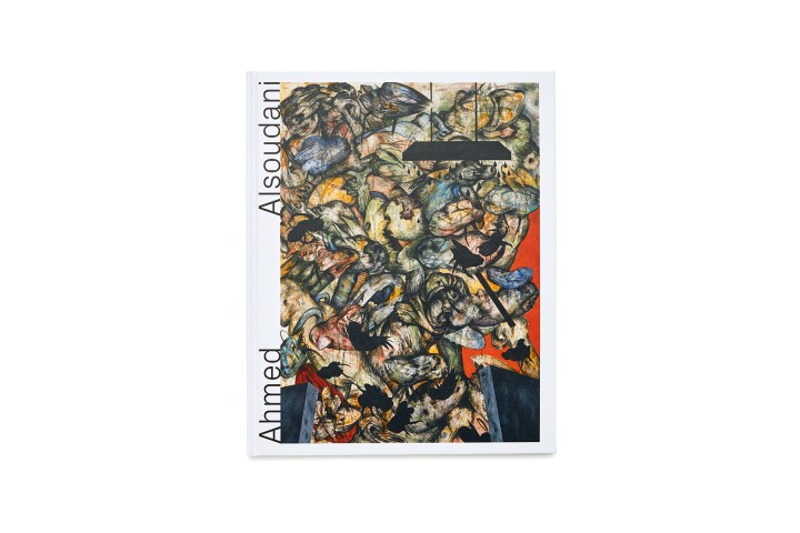
1/
18
AHMED ALSOUDANI
category: catalogue / 2017
client: Marlborough Contemporary
details: 290 × 360 mm, 60 pp.
awards: TDC New York 2018

1/
14
BASIC RESEARCH – NOTES ON THE COLLECTION
category: catalogue / 2014
client: Museum Kurhaus Kleve – Ewald Mataré-Sammlung
details: 218 × 305 mm, 64 pp.

1/
28
BEVERLY PEPPER
category: catalogue / 2019
client: Marlborough Gallery
details: 240 × 340 mm, 76 pp.

1/
15
CARL ANDRE
category: catalogue / 2011
client: Museum Kurhaus Kleve – Ewald Mataré-Sammlung
details: 216 × 270 mm, 152 pp.
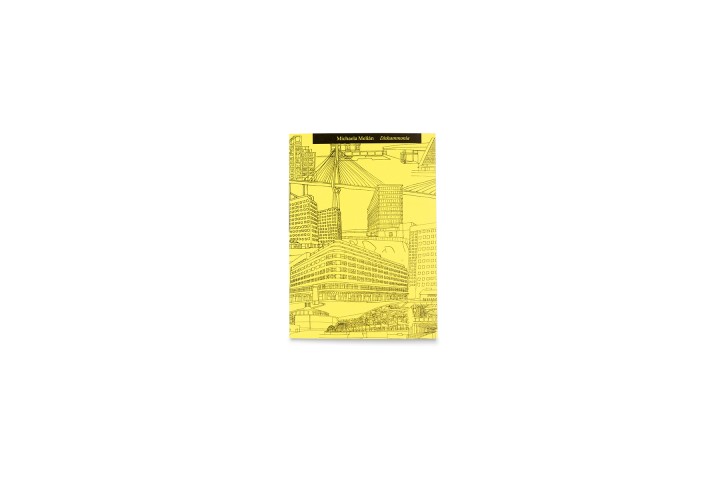
1/
24
DISHAMMONIA
category: book / 2019
client: Michaela Melián / Spector Books
details: 120 × 170 mm, 76 pp.

1/
15
FRANZ GERTSCH
category: catalogue / 2015
client: Saarlandmuseum
details: 230 × 320 mm, 68 pp.

1/
40
FRIEDRICH VON BORRIES. POLITICS OF DESIGN, DESIGN OF POLITICS
category: magazine / 2018
client: Die Neue Sammlung – The Design Museum
details: 232 × 328 mm, 160 pp.
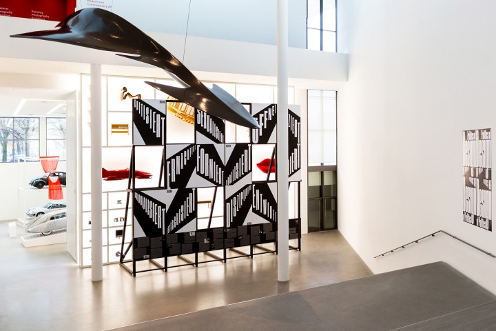
1/
10
FRIEDRICH VON BORRIES. POLITICS OF DESIGN, DESIGN OF POLITICS
category: exhibition graphics / 2018
client: Die Neue Sammlung – The Design Museum
Exhibition venue: Die Neue Sammlung – The Design Museum
details: exhibition design by Friedrich von Borries
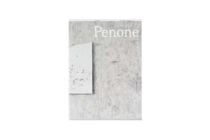
1/
34
GIUSEPPE PENONE
category: catalogue / 2019
client: Saarlandmuseum
details: 230 × 320 mm, 84 pp.
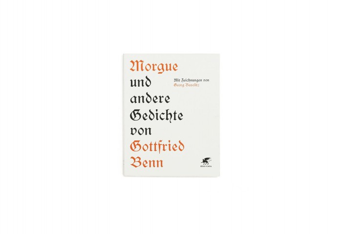
1/
8
GOTTFRIED BENN. MORGUE UND ANDERE GEDICHTE
category: book / 2012
client: Klett-Cotta
details: 162 × 182 mm, 32 pp.
in collaboration with: Michael Zöllner
awards: Schönste Deutsche Bücher 2012

1/
20
GOVERT FLINCK. REFLECTING HISTORY
category: catalogue / 2015
client: Museum Kurhaus Kleve – Ewald Mataré-Sammlung
details: 240 × 330 mm, 236 pp.
in collaboration with: Cyrill Kuhlmann
1/
15
GREGOR HILDEBRANDT
category: catalogue / 2015
client: Saarlandmuseum
details: 230 x 320 mm, 160 pp.
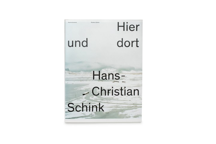
1/
24
HANS-CHRISTIAN SCHINK. HIER UND DORT
category: catalogue / 2018
client: Saarlandmuseum
details: 210 × 280 mm, 92 pp.
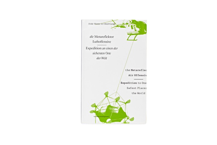
1/
20
HEIKE MUTTER & ULRICH GENTH. METAREFLEKTOR LUFTOFFENSIVE
category: catalogue / 2006
client: Heike Mutter und Ulrich Genth
details: 210 × 330 mm, 56 pp.
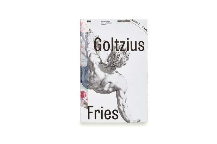
1/
42
HENDRICK GOLTZIUS & PIA FRIES. PROTEUS & POLYMORPHIA
category: catalogue / 2017
client: Museum Kurhaus Kleve – Ewald Mataré-Sammlung
details: 198 × 305 mm, 260 pp.
awards: TDC Tokyo 2019 Excellent Work

1/
29
HOCHSCHULE FÜR BILDENDE KÜNSTE HAMBURG
category: book / 2017
client: Hochschule für bildende Künste Hamburg
details: 195 × 288 mm, 164 pp.
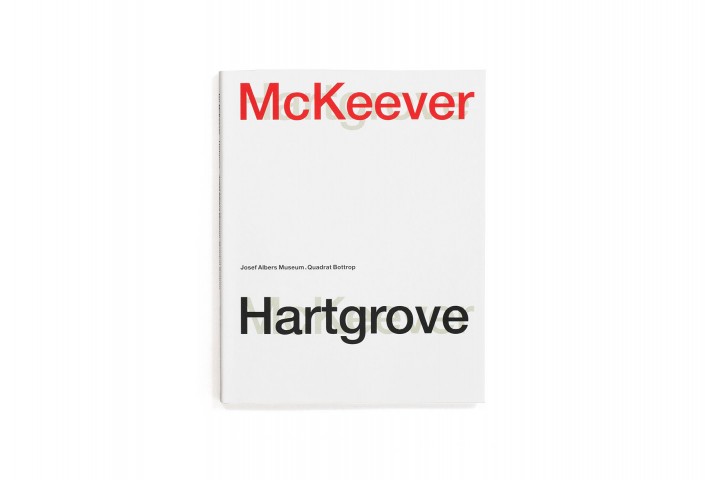
1/
18
IAN MCKEEVER. HARTGROVE
category: catalogue / 2012
client: Josef Albers Museum Quadrat Bottrop
details: 230 × 290 mm, 156 pp.
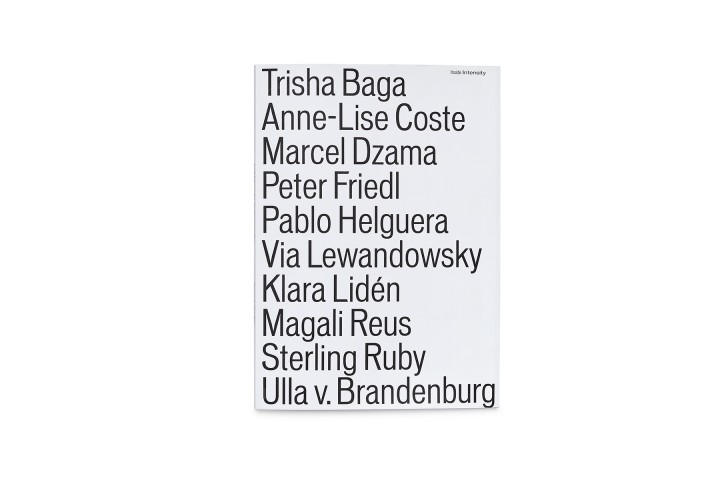
1/
22
INSIDE INTENSITY
category: catalogue / 2017
client: Museum Kurhaus Kleve – Ewald Mataré-Sammlung
details: 218 × 305 mm, 68 pp.

1/
13
JAMES BISHOP. MALEREI AUF PAPIER / PAINTINGS ON PAPER
category: catalogue / 2017
client: Josef Albers Museum Quadrat Bottrop
details: 220 × 275 mm, 124 pp.
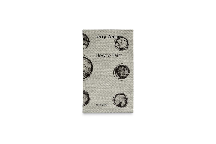
1/
23
JERRY ZENIUK. HOW TO PAINT
category: book / 2017
client: Josef Albers Museum Quadrat Bottrop
details: 144 × 236 mm, 144 pp.

1/
10
JOSEF ALBERS MUSEUM QUADRAT BOTTROP
category: visual identity / 2008 –
client: Josef Albers Museum Quadrat Bottrop
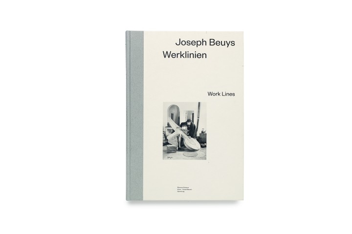
1/
23
JOSEPH BEUYS. WERKLINIEN / WORKLINES
Gattung: Katalog / 2016
Auftraggeber: Museum Kurhaus Kleve – Ewald Mataré-Sammlung
Details: 200 x 290 mm, 288 S.
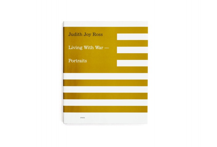
1/
11
JUDITH JOY ROSS. LIVING WITH WAR – PORTRAITS
category: catalogue / 2008
client: Josef Albers Museum Quadrat Bottrop, Steidl
details: 240 × 300 mm, 164 pp.

1/
41
KAZUO KATASE. KATAZUKE
category: book / 2018
client: Museum Wiesbaden
details: 164 × 230 mm, 124 pp.
awards: German Design Award 2019
1/
17
KURT KOCHERSCHEIDT. MALEREI
category: catalogue / 2013
client: Josef Albers Museum Quadrat Bottrop
details: 240 × 300 mm, 144 pp.
1/
27
MARTINA SALZBERBER. ARBEITEN / WORKS
category: catalogue / 2005
client: Martina Salzberger
details: 116 × 160 mm, 248 pp.
1/
13
MUSEUM KURHAUS KLEVE – EWALD MATARÉ-SAMMLUNG
category: visual identity / 2012 –
client: Museum Kurhaus Kleve – Ewald Mataré-Sammlung
1/
20
MUTTER/GENTH
category: catalogue / 2015
client: Heike Mutter und Ulrich Genth
details: 230 x 295 mm, 200 pp.

1/
17
PEPE DANQUART. LAUF, JUNGE, LAUF! FRAGMENTE EINES FILMS
category: book / 2014
client: Pepe Danquart, Alexander Verlag Berlin
details: 165 × 240 mm, 120 pp.

1/
23
PIA FRIES. MALEREI 1990 – 2007
category: catalogue / 2007
client: Richter Verlag Düsseldorf
details: 235 × 285 mm, 192 pp.

1/
25
R.B. KITAJ. THE EXILE AT HOME
category: catalogue / 2017
client: Marlborough Contemporary
details: 240 × 340 mm, 92 pp.

1/
9
STUDIO KATHARINA GROSSE
category: visual identity / 2004
client: Studio Katharina Grosse
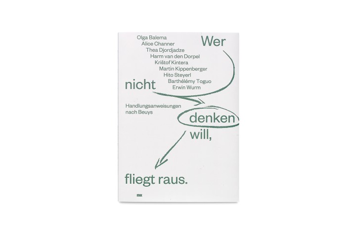
1/
22
WER NICHT DENKEN WILL, FLIEGT RAUS
Gattung: Katalog / 2016
Auftraggeber: Museum Kurhaus Kleve – Ewald Mataré-Sammlung
Details: 218 x 305 mm, 68 S.
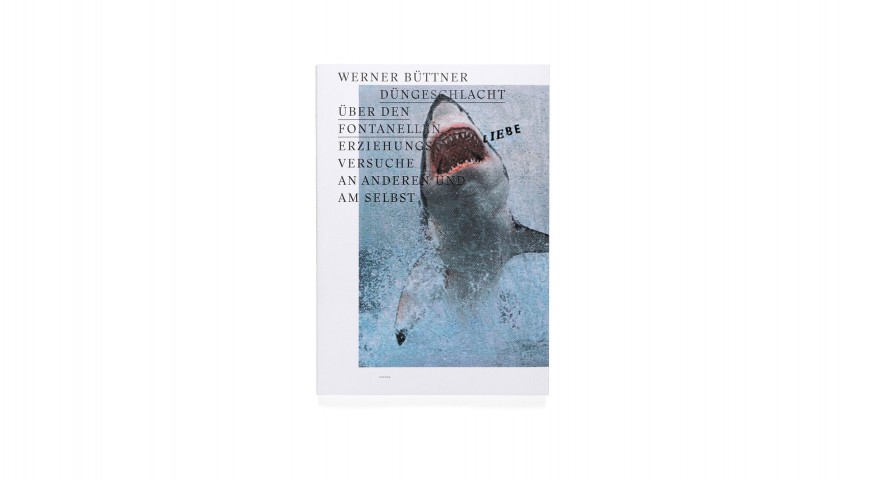
1/
17
WERNER BÜTTNER. DÜNGESCHLACHT ÜBER DEN FONTANELLEN
category: book / 2014
client: Werner Büttner, Textem Verlag
details: 223 × 320 mm, 172 pp.

1/
28
WERNER BÜTTNER. POOR SOULS
category: catalogue / 2016
client: Marlborough Contemporary
details: 228 × 326 mm, 96 pp.
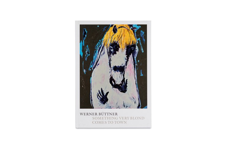
1/
29
WERNER BÜTTNER. SOMETHING VERY BLOND COMES TO TOWN
category: catalogue / 2019
client: Marlborough Gallery
details: 240 × 340 mm, 92 pp.
DESIGN
“Leave your ego, play your music, and love the people.” 1
“According to the most well-known principle of Humboldt’s philosophy of language, language is ‘the formative agent of thought.’ In language the productive activity of the mind, one could also say: its performative potential, is expressed. Language is no given system of signs and symbols, no tool of communication, but rather a creative force (energeia) that fundamentally determines man’s relationship to reality. Humboldt describes it as a ‘logical intermediate world,’ a ‘world of vocal sounds,’ which the mind, by its own power, must place between itself and external objects in order to internalize and cope with the objective world. This is why language so decisively determines our worldview.” 2
“If one denies language its deviations and indirectness, it becomes a yell or a command. If walking lacks all hesitation, all pausing along the way, it ossifies into a march.” 3
“Every translation is primarily the result of a design process involving language as its substance. The process does not emanate from focusing on an object, but rather from focusing on the tension between two ways of handling an object. This is a process in which the ‘what’ takes a backseat to the ‘how.’ […] The ‘what’ is only of interest inasmuch as it discloses layers of the ‘how.’ These extend farther and deeper than most readers imagine. […] As a non-native speaker, the translator is constantly balancing between chasms and abysses – between two languages, two worlds made up of images and sounds, between calling out and listening, listening and writing, skill based on knowledge and art beyond the pale of knowledge. To whom is he answerable? To language itself.” 4
“‘Remember me, whispers the dust.’ (Peter Huchl) And one hears in this that if we learn about ourselves from the time, perhaps time, in turn, may learn something from us. What would that be? That inferior in significance, we best it in sensitivity. […] that passion is the privilege of the insignificant.” 5
“The old ritual: Stand back, look, approach again, grasp, feel, hesitate, then sudden activity and then another long pause …” 6
CLIENTS (SELECTION)
museums & galleries
Buddenbrookhaus Lübeck
Die Neue Sammlung – The Design Museum
Huis Marseille Foundation for Photography
Fondation Custodia
Josef Albers Museum Quadrat Bottrop
Kunstmuseum Winterthur
Kunstsammlung NRW
Marlborough Gallery, New York / London
MARTa Herford
Museum für Kunst und Gewerbe Hamburg
Museum Kurhaus Kleve – Ewald Mataré-Sammlung
Rijksmuseum Amsterdam
Saarlandmuseum
Skulpturenpark Waldfrieden
Stedelijk Museum Amsterdam
ZKM | Zentrum für Kunst und Medientechnologie
artists
Katharina Grosse
Judith Joy Ross
Olav Christopher Jenssen
Michaela Melián
Mutter/Genth
Pepe Danquart
Pia Stadtbäumer
Stefan Panhans
Werner Büttner
Wim Wenders
publishing houses
Hatje Cantz
König Books
Klett-Cotta
Manesse Verlag
NAi Publishers
Richter & Fey Verlag
Richter Verlag Düsseldorf
Schirmer und Mosel
Spector Books
Steidl
Tropen Verlag
Uitgeverij Vantilt
Verlag der Buchhandlung Walther König, Köln
INGO OFERMANNS
1972: born in Aachen
1999: Diploma in Fine Arts, Academy of Fine Arts, Munich
2001: Master of Fine Arts, Werkplaats Typografie, hoogeschool voor de kunsten, ArtEZ, Arnhem (Netherlands)
2001: Launching of Ingo Offermanns, design
2004/2005: Lecturer at the hoogeschool voor de kunsten, ArtEZ, Arnhem (Netherlands)
2005/2006: Visiting professor at the School of Design, Carnegie Mellon University, Pittsburgh, PA (USA)
2006 to present: Professor of Graphic Arts at the Hochschule für bildende Künste (HFBK) Hamburg www.klassegrafik.de
2015 to present: Editor in chief of the research platform Inter Graphic View www.intergraphicview.com
2016 to present: Member of the Alliance Graphique Internationale (AGI) www.a-g-i.org
+49 (0)173 2158502
ingo@i-offermanns.de
i-offermanns.tumblr.com
IMPRINT
owner: Ingo Ferdinand Offermanns
Eichenstraße 43, 20255 Hamburg, Germany
+49 (0)173 2158502
ingo@i-offermanns.de
tax identification No.: DE 252426817
Ingo Offermanns studio makes every effort to ensure that the material contained on its website is current, complete and correct. Despite this, errors and mistakes cannot be completely ruled out. Ingo Offermanns therefore cannot be held responsible for the topicality, correctness, completeness or quality of the information provided. Parts of the pages or the complete publication, including all information and offers, may be extended, changed or partly or completely deleted by Ingo Offermanns without notice; nor is Ingo Offermanns responsible for the availability or any contents linked or referred to from our pages. If any damage occurs by the use of information presented there, only the author of the respective pages may be held liable, not the one who has linked to those pages. Furthermore Ingo Offermanns is not liable for any postings or messages published by users of discussion boards, weblogs, guestbooks or mailing lists provided on our site.
All rights reserved. Unless otherwise indicated, all materials on these pages are copyrighted. No part of these pages, either text, audio, video or images, may be used for any purpose without explicit authorization by Ingo Offermanns. Therefore, reproduction, modification, storage in a retrieval system or retransmission, in any form or by any means, electronic, mechanical, or otherwise, is strictly prohibited without prior written permission.
responsible for content: Ingo Offermanns
design & development: David Liebermann, Maximilian Kiepe
photography: Ernst Christian Dümmler, Shuchang Xie, nizza.cc, Edward Greiner